30 April 2009

Some more Little Gems

These now have their labels sewn on and have been posted on the Little Gems website.
"Time and Tide" has a sheer layer olding down the fabric underneath, and is quilted in (my favourite!) parallel lines - "Square peg round hole" is a way of putting to good use the bondawebbed bits of fabric that you cut circles out of. I like the way those square bits can be stretched to reveal the cut where the scissors have entered -
"Measure for measure" uses teeny scraps of silks, originally intended for postcards. I just couldn't throw those lovely colours away...nor could I resist buying a fat quarter of the tape-measure fabric. The only quilting - maybe it's too little? is around the central panel. But that panel does have a lot of stitching on it -

Modernism and postmodernism

Contextual studies - aka art history. Postmodernism emerged within architecture. It had crises of originality (everything's been done) and of identity (if everyone is an artist, what does an artist do). One of our small-groups tasks was to decide whether some paintings were modern or postmodern. Surely that's a Dali (=surrealist=modern) at top left? (No; it's an appropriation=postmodern. The artist is Glenn Brown, currently showing at Tate Liverpool.)
My group missed the fact that these weren't abstract (=modern) paintings, but some rather famous hospital doors (the original is in colour) -
In the afternoon, learning how to use sketchbooks for research. You don't carefully draw the entire object, you focus on the bit you're interested in - ie, if you need to know how a certain part of it works, you draw that bit in detail. Obviously obvious, but needs to be said now and again.
Yet again I shied away from using lots of colour and doing huge drawings. I prefer pen, and lots of small things on a page - hmm, why...

29 April 2009

Petit cabanon

Caught a little exhibition of Le Corbusier's petit cabanon at RIBA - on the last day.
The beach hut was wonderful. Only 12 feet square but it has everything you need. No kitchen; there was a good restaurant next door! It's been recreated by the furniture company that's reproducing his furniture designs. You want to move in immediately, enjoy the mediterranean views...
You can see inside via this video. Doesn't the bed look small?
The outside walls were blackboards and chalk was supplied for visitors to add comments. Irresistible...

28 April 2009

Handbag quiltlet

This is April's quiltlet for the BQL challenge. The idea of handbags didn't excite me much, but once I got going it was fun. I didn't have the "proper" patterns to hand, so cut a shape out of silk or velvet, put it in the centre of the backing square (straight onto the wadding), foundation pieced first the sides and then strips on the top and bottom, and joined the squares.

Look at how much difference the quilting makes:
A few trimmings, and it's done -
Next time -plastic bags on a velvety background, perhaps?

Spring on the Oxford Canal


Forget-me-not with fresh paint.

Taking an interest


Using monochrome

Having discovered the Monochrome setting on my camera, and still puzzled by the interaction of tone and hue, while waiting for the train I wondered how the tone of the fresh green leaves would match up to the clear blue sky -Well they don't, really - maybe in summer? - but the clarity of the original photo, downloaded, astonished me.
And it's interesting to try to "see" in black and white.
These ducks, however, were photographed in colour, into the glare -

26 April 2009

Sculpture 1

Again, first day of a three-day session - working on one project. We'll be making an environment within a box - somehow - with the starting point being the psychological implications of how the box is used, and relating one or two of these potentially emotional words: Secrecy; Claustrophobia: Treasured; Expansive; Theatrical; Labyrinth. In the group crit on the third day, the others will try to figure out which of these words was the starting point.

Some things to think about:
1. What does the word actually represent?
2. What kind of box to underline the concept?
3. How to create the illusion of space perspective, colour, patterns...
4. How do you look at the message in the box?
5. Is it necessarily going to be a visual approach?
6. How does light enter the space?
First we "word-stormed" - here are a couple of the results -

Then we got busy on worksheets and with the materials to hand. My first attempt needs a rethink -
...or, a fresh cut -- a slip of the scissors and you could have ... a window-box?
You gotta be open to new ideas, right?
And here are some sculptural snacky things - "lips and teeth" (jelly babies) -

25 April 2009

Another "sweet" Little Gem Quilt

This will be two Little Gems -- starting with a patchwork of sweet (candy) wrappers, under a sheer layer. It's tacked down with colourful threads, ready for machine quilting.

Some of the foil was torn and you could see the batting, so I added a few stitches to cover up the gaps -
And liked doing that kind of handstitching (the batting is a wool blanket, and wool is great for handstitch) - so now all the edges are getting that treatment -
It seems to cry out for beading, now, rather than machine stitching. Or, one with machining, one with beads. We'll see.

Printmaking 1

First of three taster sessions on printmaking - a chance to develop ideas and get a feel for whether this could be something to do more of: "go into it with a totally open mind and don't worry about the outcome".

And start filling those sketchbooks -- these are devoted entirely to hair, and are amazing - holes in all the pages as well, intensely worked - "this is where the fun happens" -

After a morning of introduction and looking at slides of various types of prints and the diversity of possibilities, off we went to the National Gallery to collect some ideas (and have some fun).
Now that it's been pedestrianised, the area between the National Gallery and Trafalgar Square has filled up with buskers. When these break dancers got going, the crowd got larger and larger. In the centre rear of the photo, you can see the famous Fourth Plinth, with its current temporary sculpture looking like a bit of spring greenery. It's too late to apply to become part of Anthony Gormley's sculpture (people standing on the plinth for an hour at a time, 24 hours a day) - and it seems the organisers of the project haven't applied for planning permission for that yet.

Inside, in the newest part of the gallery, the grand entrance hall, all was serene -
Meanwhile we got out out sketchbooks and "collected ideas" for a couple of hours. I'm trying to get out of my comfort zone, so brought along some colour, including (argh) felt-tips. The first room I went in had wonderfully glowing gold-orange damask fabric on the walls - and a guard with hair to match, and a red face to match the walls of the room beyond. And at first I found the viewers more interesting than the paintings.

The felt tips were useful for Europa and the bull by Guido Reni (before 1640) - and then I tried to simplify the painting -- ok, doing this does get you looking at it in a different way - and that's one of the objects of the entire drawing exercise --
Of course the felt-tips bleed right through the paper, so I started on the clean page on seeing Pietro Longhi's rhinoceros (1751) - the hatted, masked figures have always intrigued me. Doing the simplified drawing led to looking at the faces/masks only -
and to faces and other bits of visible flesh in other pictures, looking at the rhythm and spacing of those areas.
Over in a corner was a small group of schoolkids, being told about Constable's view of Salisbury Cathedral across the meadows. The museum teacher was excellent, and the kids were interested and asking good questions - and eager to do so -
Here's my "fresh view" of Longhi's fortune teller
The lovely girl's chaperone (or is it a chaperone?) is dressed in black and wearing one of those scary, pointy-nosed white masks - they're called volto or larva masks. The whole Venice-carnival-masks thing puts me off rather, but there's something intriguing about this one.
By the way the pictures on the National Gallery's website can be made larger by selecting "image only" when they come up with a description - and they also have a Zoom possibility for a good look at details. And the pictures on Wikipedia, if you click to enlarge them, tell you about their copyright status.

Colour 1 revisited

Using the camera to look at my tone choices, I arrived at this - a big improvement on matching tones merely by squinting -Is this cheating? Not if you have a go first, and then check your best guess. It can take a while to arrive at a best guess - and it's surprising to see what the actual colours are -


23 April 2009

Colour 1

Class started with a slide lecture, including a demonstration of how additive colour works - three overhead projectors with sheets of coloured acetate - orange + violet + green = white. And I didn't think to take photos....

A quote from Van Gogh, about complementary colours: they are like lovers, continually fighting, but they excite each other to maximum vividness when they are next to each other.

The three dimensions of colour are hue (its ancestry: blue, red, etc); tone (more of which later); chroma (intensity). As I understand chroma, a colour becomes less and less intense if you add more and more of the complementary colour to it. Here's one I prepared earlier - it's really about colour mixing, but in the vermilion-cerulean line near the bottom you can see how the combination reaches the achromatic state (grey) -
Colour "happens" in paintings when there is contrast - but there are various kinds of contrast - light v. dark (tone); hue; complementary (which may also be known as successive contrast - I'm not clear on this); simultaneous, where closely-related colours give a "glow", or when an intense colour is next to grey, the grey picks up the opposite colour; proportion; and temperature (warm and cool).

It was fun to stare and stare at blocks of colour, then look at a white surface and see the after-image in the opposite colour. Try it yourself here at the bottom of the page.

Johannes Itten and Joseph Albers are the uhr-gurus of colour. Look and read, read and look...

Then the tonal exercises. Make a tonal scale with various hues (these are from a paint-chip card). Homework is to match those tones by mixing up various shades of grey.
Then, finding different hues of the same tonal value, light medium dark. The photo in monochrome mode shows I didn't do so well with the medium values - indeed with any of them; might have to try a different brand of paint chips -

After class I went to the Gerhard Richter Portraits exhibition, and stopped in at the art store for some black and white paint, but ended up bringing home some of the rest of the spectrum as well ...

Gerhard Richter Portraits

Richter is known both for figurative work based on photographs and for abstract paintings. The exhibition starts with early black and white paintings made from magazine photographs, as well as from his own photographs. On the left is Ella, his daughter, painted in 2007 - her downward gaze references a self-portrait of 1996 in which Richter is looking down.


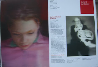
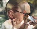
On the right is possibly the most disturbing portrait in the exhibition, again a family member, his father, Horst, from a photo taken at his sister's wedding in 1959. "The image is an unflattering one," says the caption, "showing Horst holding a woman's hat, with clown-like hair and what the artist describes as 'a ridiculous Spitz dog'. After Horst's death, Richter discovered that Horst was not his biological father: appearance and reality being separate not only in Richter's art, but also in life."

Instead of having to read captions on the wall, you are given a little square book with a caption on each page - perfect for making thumbnails to remind yourself of the pictures later (and the words can be considered and rearranged in a blog entry). The exhibition is in 5 rooms: The most perfect picture; Devotional pictures; Continual uncertainty; Private images; Personal portraits - a classification imposed by the curator.

Why did Richter use photographs? The booklet says: "He was seeking a more direct and objective way of representing the world. A photograph, being machine-made, was in his view 'the most perfect picture'. Using photographs as the basis for paintings freed him from conventional artistic processes involving the creation of motifs, colour, composition and expression." (An artist who wants to be free of conventional artistic processes - at a time when the artmakers were moving into what's called postmodernism - ok.)
He said: "I don't think the painter need either see or know the sitter. A portrait must not express anything of the sitter's 'soul', essence or character." And also, "I don't know what I want. I am inconsistent, non-committal, passive; I like the indefinite, the boundless; I like continual uncertainty."
The portraits increasingly sustain the tension between inviting yet resisting interpretation; he commented, "You realise that you can't represent reality at all - that what you make represents nothing but itself, and therefore is itself reality."
And then there's the blurring. It "removes the excess of unimportant information".
And the ambiguity, which is analogous to everyday experience, where appearances conceal an unknown reality.
The central theme of his work is that reality cannot be seen or known but remains hidden beneath a veneer of appearance - and these portraits express this impersonal reaction - no interpretation from the artist, or imposing of meaning - yet event hough he intends "to leave everything as it is" he acknowledges that "something new creeps in ... that even I don't really grasp".

See more here, including this multiple-exposure portrait of Gilbert and George, which for me was the most interesting single piece in the show:
Richter said also, "You relaise you can't represent reality at all - that what you make represents nothing but itself and therefore is itself reality."