Pages

31 May 2012

Letterpress edition

The edition of the original "Seepage" book is underway. With a little help and a lot of spacing, I got the text block tight, and started printing from the back - the page that's all text. 
Ready to ink up, ready to roll
Fortunately there wasn't a crowd in the workshop, so I could use the proofing press solidly and lay out the pages. After wondering how big (or small) an edition to make, that matter solved itself - there was room to lay out 12 sheets - which also meant that the A3 pad of 30 sheets of tracing paper, cut into quarters, would be enough.

Tracing paper needs to dry for as long as possible
The "erasure" bit involved looking critically at the previous version and considering changes - one such change was to make the book a page shorter than the previous version.
Turning over text to "erase" it
 I was pleased, after three hours, to have a dozen sets of three pages printed, layered with newsprint, and stacked safely in a folder.  Taken out at home, they look smudge-free, but closer inspection shows that the inking needs more attention -
Something to improve "next time" ... next week.

Book du jour - a weekly calendar

Many calendars are available on the web to download and print out, but I knew exactly what I wanted for mine, so whipped it up in InDesign, printed it out, and set to work with the bone folder (very soothing) and glue.
It has a column for each day of the week, divided into a "to do" section (tasks and appointments) and a "have done" section.
Sixteen weeks are contained between greyboard covers.
Practice in making slipcases is called for
Because concertina books love to slide and spread and snake all over the place, it has a slipcase, made of some waxed paper that happened to be at hand - in case I need to take it around (like a security blanket?).

I'll try to keep to three main tasks for each day. And remember to write down the achievements.

This is my first SOD acted upon - and noted. Back to that list...

Being moved along

On Tuesday we had a seminar. In the morning, professional practice - introduced by a quote from Grayson Perry: "Turn up on time, be nice, and work hard" - which says it all, really. The full presentation is at http://www.slideshare.net/l.bicknell/professional-practice-2012
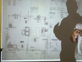
Plans will need last-minute changes
In the afternoon, a briefing on the final show (slideshowof the presentation is here and here). Certain deadlines were mentioned, and they seem very near and very final. Having been calmly and consistently working away on this'n'that, I have turned into a writhing mass of unresolved dilemmas. But the small still voice of reason is fighting its way through the tinnitus of panic, saying that there are Strategies that will help Overcome this Discombobulation (SOD). 


SOD1 - sort out thoughts - write stuff down, preferably with a bowl of Belgian Chocolate with Salted Caramel and Roasted Hazelnut ice cream to hand

SOD2 - tidy up desk area, having set the timer for 15 minutes. Focus on the desk area. Try to find a place for things rather than dump them on another surface - label those places

SOD3 - set timer for 15 minutes (again and again) and look through shelves and boxes, sequentially around the room, for ALL the work made on the course - put it ALL in one place

SOD4 - in between the 15-minute sessions, do something distracting for a SHORT time (this may require setting the timer). Repeat 15-minute sessions as necessary

SOD5 - when all work is in one place, have another writing session, perhaps with a frappuccino-style iced coffee to hand (if not too late in the day)

SOD6 - make a nice long list of things to do, and guesstimate how long it will take to do each item

SOD7 - get blog up to date with college stuff and exhibitions - be brief and incisive (!)

SOD8 - remember "Rome wasn't built in a day" - the first of the deadlines is not tomorrow, or even next week (yet)

SOD9 - make a Studio Calendar on which to write deadlines, the three tasks for the day, AND things achieved each day

SOD10 - stop work at 7pm (it's so important to have a stopping time!)

There are other SOD options of course - and "your mileage may vary" ... but it's a starting point, it's a plan.

More plans and deadlines

Along with the planning of the final show (5-13 September, for your diary) is the planning of the show catalogue. The working group came up with this format -

Everyone is to produce 85 copies of their page by 29 June. The page can be made of whatever paper you choose (you're the one supplying it, after all) and can contain whatever you want - whew, too many decisions! The flap on the right will fold over and contain makers' info in a standardised form. The book will be 24cm square, joined with book screws.

Before that, the draft plan of our space in the show is due on 27 June. We went to look at the assigned room, and it looked kinda small for 20 people. Hopefully no-one will have a huge, dominant, central installation .. but anything could happen. Drafts change. The tutorials in mid-July will no doubt be dealing with issues arising, and last-minute panics.

Our written pieces about our work are due 6 August. The show starts going up on 14 August; the examiners do their work on 28-30 August; the private view is on 5 September. 

First thing I'll do is make that Studio Calendar - various templates are available here.

Oh so English

Gearing up for the Queen's Diamond Jubilee celebrations, the "bijou" end of this street round the corner has put out the bunting -
Many of its tiny front gardens have that quintessentially English flower, the rose -
Also gearing up for a holiday weekend, the wonderful weather has turned: rain is predicted for Sunday and Monday. "Bloody typical!"

30 May 2012

Sunny morning window

The studio window faces north east. In winter, there is under-table heating;  in summer, the morning sun hits the desk, and the view is very green. I love working at a table under a window, in natural light ... with my back to the rest of the room, and all the chaos therein.

But - there's always a "but" - how to keep the necessary tools and equipment to hand, without them crowding you out? As you can see, the workspace is getting smaller and smaller. The resident carpenter hasn't had a chance to rig up the desired paper storage, and I've used this as an excuse to let stuff build up. So ... the inks etc could all go in a container somewhere else, to be moved back as needed; the bookbinding threads etc aslo. Much can be done, with a little thought and action. Tomorrow I'll be at home, in the studio, and this seems a very appropriate task for early in the day; I shall set my timer for 15 minutes, and that will make a big difference. Everyone loves a tidy workplace ... don't they?

Visitors

Sitting at the table by the window, I can look up to watch the birds feeding in the tree that is (too) close to the house. Usually it's blue tits or maybe a wood pigeon, but the other day these appeared -

Goldfinches.


Don't try this at home

This is "An anonymous author’s novel written on the walls of an abandoned house in Chongqing, China" - I found it here and though it's a wonderful image, it made me feel so sad. And frightened. It plugs into all sorts of facets of the human condition.

Here's another image of Chongqing - the city is on a bend of the Yangtze river, which floods in the summer. The floods in 2010 were the worst in a decade.

29 May 2012

Art I like - Leonardo Drew

This white work struck me because, colour aside, it links with my over-written "sonnets to be memorised" - it represents the state of mind  when, having fixed the last lines fairly clearly in my memory, I get to the start, and those lines are in confusion. Not only does it look like my work-on-paper, but it adds some of the distractions that I have tried to keep off the pristine page -
It's by Leonardo Drew and I found it here (but followed it to source...)

Drew lives in San Antonio, Texas, and Brooklyn, New York and exhibited in London in 2009. He's made some big sculptural pieces with wood and fabric, and grids and boxes - matrices deriving from Louise Nevelson - dramatic works that " recall the rags of slaves and beggars, nostalgic troves of jetsam, the reclamation of human efforts by nature, and architecture blasted by conflict" (according to this article). Do have a look at the gallery on his website.

28 May 2012

Book du jour - letterpress dud

Printing on tracing paper is tricky because the paper isn't absorbent and the ink takes a long time to dry. It's easy to get smudges --- and they can't be scraped off -
So I'm trying other transparent materials. Like repair tissue, which does have a certain amount of show-through, but is too floppy, even when waxed -
The text is some words that I threw together, and having spent several sessions printing the various pages, I'm thinking along the lines of "marry in haste, repent at leisure". It just doesn't work, for all sorts of reasons... the use of light and heavy type is in the wrong order, the lines at the top aren't suitable for this bottom-to-top revelation, the font isn't right ... etc ...

But it needs recording, and reflecting upon. Here's the stack of pages; on the left, from the front (the second page; the first is all black type and seems to have gone missing) and the back  (of the last page) - not properly aligned, and revealing some spacing adjustments in the middle pages -
I've "taken it to the end" - almost - all that remains is to assemble one copy - and then I'll jettison the rest. Or use the pages as the basis for more little black books - tracing paper does interesting things when it gets wet, and I have a big new bottle of ink....

The upside of this unsuccessful project is that I've learned to print on tracing paper very, very carefully, interleaving newsprint between the pages. It was lovely in the letterpress studio when only one other person was working there and I had room to spread the pages out a bit so that they could start drying.

New books

Both are suitably small, for taking along and reading on bus or tube. An example of books that are better as "real books" than e-books - in my opinion...

27 May 2012

Nouveau lunch

Served on a slate, no less! Hummus (with no bread), baked aubergine/eggplant stuffed with couscous, and a greek salad - separately, nice ... but ensemble, no ...

26 May 2012

Life skills - resizing, alignment, levels in photos

It's all too common to have a photo - or part of a photo - that's not quite straight. And it's all too common to have stuff round the edges of the photo that you want to get rid of, as in my photo of a page of a book.

First I used the Crop tool (4th from the top in the tool bar on the left of the screen - it looks like a hache or a box) to select the area I wanted to keep. I made it slightly bigger than needed, to allow for the straightening up adjustment -
Double click on the image and the unwanted bit falls away.

Now, a sequence of two very useful keystrokes - they're in the menu bar somewhere, but it's SO much quicker to remember a few keystrokes than to be forever mousing around.  Control + A to "Select All" - that gives you the dotted line around the image - and Ctl + T to "Transform" - that lets you change the shape of the image; it puts "handles" into the dotted line. These look like boxes at the corners and middle -
Holding down the Control key, grab the corners and move them, one after another, until the image is straight. This is the fun part. If you don't like the result, return the handles to where they were and try again. To check that it's aligned, you can use the handles in the middle, stretching them outward till the lines in your image meet the edge, then returning them and doing any further adjustment. (Sorry there's no photo for this; I only thought of it just now while writing.) Remember to use the Control key while doing this.

Once it's aligned, double click in the image. Before you can crop it (see above), you need to click outside the image to make the dotted line disappear.
Once you've cropped the image, you might want to adjust for brightness and contrast. You can do this from the menu bar (under Image - Adjustments - Brightness and contrast) - or with a keystroke shortcut, you can bring up the Levels box and have fun with the sliders. The keystroke is Ctl + L.
These screenshots are quite small (clicking on them doubles their size) but if you look carefully at the two Levels screens you can see a difference. The sliders - the arrows under the histogram (the "mountain") - have moved. Instead of being at the ends and middle of the box, they are now at the ends of the histogram - and I moved the one in the middle till the contrast in the image looked optimal. You see the levels changing as you move the sliders.
Before and after - what a difference!
With the keystroke shortcuts - and a bit of practice - this entire procedure takes less than a minute.

25 May 2012

Eclipse shadows

Intrigued by Tanya's post about the tree shadows cast during the annular partial solar eclipse in Japan, I found this photo which shows their crescent shapes (and this video). These shadow bands, in a nutshell, are the result of sunlight being distorted by irregularities in the earth's atmosphere.

Life skills - placing two photos side by side

There's probably an easier way to put "two pictures in the same frame", but this is how I'm doing it till I learn the shortcuts. (I'm using the "big" version of Photoshop, but I'm told you can do this in Elements too.)

Select your pix and open them in Photoshop.
You need both photos to be pretty much the same size. If they are fine as is, skip the next two steps.

But if they need to be cropped ... start by cropping one of the photos (using the "box" icon - the Crop tool - near the top of the toolbar, which is at the left side of my screen) -
Once it looks as you want it, check the dimensions (using Image (from menu at top), then Image Size) -
Crop and/or resize the other photo to make it the same dimensions. [I do this part "by guess and by gosh" - there's sure to be an easier way!]

Now the fun starts. Still using the "box" resizing tool (the Crop tool), select the entire image. Then use the small box halfway up the dotted line on one side of your photo to draw the cropping box outward on the side where you want to put the other photo. I make this box bigger than needed, as it can be cropped later.
Clicking in the box turns it white - you're ready for the exciting part. Go up to the grey bar above the workspace and drag down the name of the pic you want to add - doing that opens a small separate window. You can then drag the photo into the white part of the other box.
To be able to drag the second photo into the white area, you must select the arrow in the menu bar - it's at top left on my screen. Then move the other photo into place (and either close the small window or drag it back where you got it from) -
 Voila!
Don't forget to save your new, double photo with its own new name.

24 May 2012

Book du jour - leaves

Excited by the photo of the leaf with printing on it, I collected a few leaves on the way to letterpress and had a go.
It proved quite tricky to get the leaf positioned in the right place as it slid through the proofing press under several sheets of newsprint. The plane leaves and those oval ones, being quite firm, even waxy, got easier to deal with, but the ?aspen ?lime leaves quickly went floppy - and one rolled itself up and got chewed by the type -
Now they need to dry - some are drying in the open, others pressed in a book.  Next step (if the drying works) - put appropriate text on them - but that will have to wait, as there's unlikely to be a way this fits in with my "everyday journeys" project. Also, there's the small matter of making books from the "real" pages printed today.

Wire and beads

We have a small collection of tin-can and beaded animals, and these eland (are they eland?) would fit right in. The beaded baskets are simply gorgeous. They are made in South Africa, of course - Capetown to be exact - read about Streetwires in Hand/Eye magazine (photo is one from the article). This fair trade organisation provides employment for 120 people, many of whom learned to make tin-can objects as children.

As the article says, "The origin of this traditional craft is still unknown, but is speculated to have developed out of Maputoland and Zululand in the northeast corner of South Africa. It was here where the village elders’ took notice of the childrens’ ingenuity as they were making model cars, bikes and other toys out of anything from rubbish to tin cans, bits of old fences and discarded metal hangers. Their work is impressive as they assemble fully functioning cars with independent axles, steering wheels and headlights. Their resourcefulness inspired the adults within the communities’ to create these types of crafts and sell them to tourists."

23 May 2012

Ribbons of words

Among the many images of sculptures of Jaume Plensa, this caught my eye
Usually he uses words/letters to define the human form - and the blogger who previously used this photo takes issue with the practice: "I was distracted by the type. Why has he used a sans serif font? Why are the words in English (although, I subsequently discovered that he does use other languages)? Am I supposed to read the text? Why doesn’t he write a book instead of creating sculpture?" - indeed, why?

However, ribbons of words have intrigued me for a long time - the medieval sort found on tapestries and in paintings, rather then name tapes (though name tapes have their own possibilities) -
Is there a name for these ribbons? They're not quite cartouches... and not speech bubbles in our modern sense.

Two other things tug at my memory in connection to these ribbons of words - an article I once read about them, and have largely forgotten; and a textile artist who weaves figures onto ribbons and then folds the ribbon back on itself and sews it together into cloth. I am resisting searching for these, as that might lead to all sorts of byways and much use of time that needs to be spent otherwise.

A leaf out of a different book

Getting a card through the post, how unusual is that, these days - I was thrilled with this one (and immediately longed to try some printing onto leaves) - thank you, Erika! The photo is by Chema Madoz, on whose website it can be seen found, in company with other objective yet cryptic photos -

22 May 2012

Apples and fork bombs

This homage to Jan Gossaert comes from here. Charlie Gere showed it as part of his talk, "Rethinking the Digital", at Jerwood Space, which concerned the role of "the hand", and touch, in the technological environment and its notions of community. As soon as people started counting, or naming things, we were in the digital age, he contends - things became discrete, separated from each other. He quoted someone - I didn't catch who - as saying "without borders there would be nothing at all" (it might have been Malcolm McCullough?). Derrida was mentioned a lot, and Marshall McLuhan; Jean-Luc Nancy ("On Touching"), and Andre Leroi-Gourham are among those new to me. The books mentioned make a substantial reading list. Also new to me was the concept of  "fork bomb" - but I didn't catch whose artwork this was, only that it was made in 2002 (and it doesn't say here, which is the only image I could find) -
Interesting, too, how evolution into a bipedal creature freed hominids to use their hands and make tools - things separate from themselves - and how the brain subsequently enlarged through this new haptic skill.

Next, Leap will track and mimic hand movements, and get rid of the keyboard and mouse - how long before we're "writing in the air"?

Watch it online at http://vimeo.com/45433674 

The greenness of gardens

After four therapeutic hours in the garden, weeding and pruning - refilling the compost bin, and putting all the woody prickly stuff in the Green Bin - I'm itching to get out there again. At last it was dry enough and (almost) warm enough to enjoy this encounter with tamed (?) Nature -
A small gardenit may be, but there's always a lot to do, somehow.

Which brings me to Andrew Marvell's "green thought in a green shade" - aka The Garden. Another memorable phrase in the poem is "this delicious solitude". In a little green book, an exhibition catalogue from 1989, it says: "Marvell was writing at a moment of tremendous social upheavel, at the time of the [English] Civil War, and in his poem The Garden he celebrates, with great wit and conscious artifice, the idea that a garden provides solace and refreshment for the spirit."

The exhibition was of the photographs of Paul Joyce and drawings of John Hubbard, made (separately) in the gardens of Abbotsbury in Dorset and Tresco in the Scilly Isles.
"Both artists respond to the particularity and tenacity of living things - the plants and trees which co-exist in these eclectic, man-made paradises. Each brings his own interests and preoccupations into the gardens, which offer an interlude for contemplation, becoming places of the mind, disturbing, ambiguous and fascinating. The exhibition is a conversation between two distinctive visions, using different visual means but above all it suggests the essential solitariness in the activity of looking closely at natural things. We can share a certain amount but in the direct experience of nature we are alone and very much ourselves."

(It's timely to happen upon this notion of solitary activity and looking closely, as this is exactly what I'm doing in my work on/with sonnets - yet until reading this, it wasn't something that I could put into words.)

In pre-digital days I cut out and kept lots of pictures of things, and newspaper cuttings, and slipped them into relevant books. This little book contains some items from Kew Magazine, one as recent as 2006 -
Another memorable book about "greenness" is an artist's book held in the Poetry Library - it consists of blank pages in various shades of green and is called "After Marvell".

If you like gardens, do go read the Marvell poem - you can find it illustrated and explained here. And for a virtual visit to a beautiful garden, here you can John Hubbard's garden in Dorset.