Pages

28 February 2009

Little Gems

The central portion was intended for fabric postcards - little snippets stitched onto a bit of pin-striped fabric. I couldn't resist buying a fat quarter of the measuring-tape fabric.
This crazy-patch was covered over with a layer of sheer, and cut back on the dark red shapes. And some lines of zigzag added here and there -
"Pond life" was pieced over papers and includes a lot of embroidered weed in between the bigger stems growing from the bottom of the murky pond -
Eventually these will appear on the Little Gems website - first they need labels. Why are the labels so onerous - they take forever to get around to, but don't actually take long once you do get round to them....

27 February 2009

Life drawing, week 2

First, some gestural drawings - the aim is to start at the middle rather than outline, and I kinda lost sight of that - The last of these turned into a longer pose - and then we took black chalk and filled in the background, then looked at everyone's to see the relation of the form to the background. Nearly everyone cut off some of the sides or top or bottom, to fit the form into the space better.
Two poses that involved looking through a viewfinder first of all, to find out whether the orientation would be portrait or landscape - which way did the model best fill the space? Then we worked with red chalk for the body, black chalk for the negative spaces, and in switching between the two tried to see the shape of the body in this non-standing-up position as it really was, rather than as we expected it to be:
A very interesting exercise - who knew the legs would take up so much of the paper!

26 February 2009

Drawing class, week 8

...or, signs of a struggle...

Drawing the cube I made the day before - and it proved as slippery in reconstruction as it was to put together with sticks and string. With all walls of the cube set out, it looked to be coming along - despite a few problems with proportion of the sticks -
Another hour goes by, things are rubbed out and replaced but still the sticks in the top layer are in the wrong relation to each other (they should mirror the layer below) - After four solid hours, the first drawing is more or less ok, given that we were using 2B pencils and the rulers were too short to space out the vanishing points and make nice big boxes -
plus that second drawing was quickly done and went more easily -- the trick is to start at the back, with the bits that get hidden, and get them into position. And to use diagonals to divide the "sides" into small areas. This project was frustrating at times (too detailed in the small space?), but I really enjoyed doing it ... possibly because it's something you can get "right", with enough thought and application. (Also, I like the subtlety of all those rubbings out in the first drawing!)
Downstairs, the showcases near the cafeteria have some of the class's work - including Rapunzel's Tower along with the objects that can move -

3D, week 8

Last week in drawing class we were "crating" in 2D, and now in sculpture class we are crating in 3D. The brief was to make three cubes or 3D rectangles, and put another shape of the same scale within one of them. Material could be wire, wood, card - I wanted to try all three, but was seduced by the idea of making wooden cubes of variable size using the same size sticks, with different amounts sticking out at the corners. But how to get the sizes -- and how to hold them together?
Wire was a nuisance - I should have known, from my rather negative experience with the chicken-wire chicken. What a relief to use string, drapey, compliant, familiar string! It took quite long lengths to loop round from every direction and angle. And to my delight, the sticks could be pushed along even when securely tied, making different sizes of solid possible.
Try as I might to get all the corners the same (ie, each side a proper square), it just never worked. One stick was always in the wrong position... But there were lots of possibilities for configuring the three. Pinning together one stick on each block would have been elegant - like something heavy lifted effortlessly into the air.
The configuration of choice turned out to be a kind of toppling tower. The other shape, in the top cube, is the sphere of tissue paper -- with its flaring tail left on -- a comet that has crashed into the top. The extra strings hold the three cubes together; and I couldn't resist adding more, thinking of Rapunzel trapped in the tower, letting down her hair so her lover could climb up and visit. (Other stories, interpretations, views are possible, of course.)The people who bent and taped metal seemed to be making the fastest progress on this project. And I liked their delicate structures. Perhaps wire is something for "next time".

24 February 2009

Drawing class, week 7

"Crating" consists of drawing a box in perpective, then placing an object in the box so it too will be in perspective. All was going well until I put the chimney on the house and instead of following instructions, had to think for myself.
Some notes on how to do it:
In the afternoon we put all the tables together in the middle of the room and presented our altered books - we had 4 minutes each, and were kept strictly to time, with bouts of mad applause ending each presentation.
Among the memorable ones were Goldfinger, which had about 100 pages painted gold on both sides, sometimes leaving words peeping out, sometimes with drawings on the gold, and between each page an insert of photocopies of "ladies" done on acetate - gorgeous!
The Seeds of Time became a "frozen moment" sitting on its plinth, slowly melting to reveal the book.
Another book was speared through by a pair of scissors; a magazine from 1851 got updated with 21st century images. Another was 'presented' as the finale of an enactment of a scene from Shakespeare.

I happened to be the last person to tell about my book -- did it in Chinese as planned, pulling the book from its black silk bag after taking rather a deep breath. (Later, the chinese-first-language person among our diverse group told me of a better word for the stamp made by the seal, a word that wasn't in the dictionary I used to put together my little talk.)

Altered book - final stages

All the English-to-Chinese pages have been stamped, all the selected words have been listed on the first page of each letter, the presentation has been written out - the seal is stowed safely away in its cave in the Chinese-to-English section - and now the book needs a bag to "live" in --

The finished bag looks reasonably "chinese" -
About an hour before the presentation, I decided to change the second part of the presentation....
Maybe it's nonsense. But when you can't understand an explanation, you have a chance to make your own story about what's going on. Is it more frustrating to have an explanation that doesn't make sense, or no explanation at all?

23 February 2009

Making many from one - update

The panel that is to become nine Little Gems is coming along. Some of the areas have their backgrounds filled in, and you can just about see pale blue thread intended for french knots (and centres for the purple flowers) and the orange variegated rayon intended for sead stitch, lying waiting -

Here's a closeup of the "pin striped" background - the leaves need nice thick edging, don't you think? -
And here's the start of the beading on the painted background. Too much of the shiny beads will be ...too much... so I'll switch to a chunky thread in the same colour-
The extra red silk fruit cover a paint mini-catastrophe.
Here are some ideas to use on these kind of pieces:
-lines of automatic embroidery patterns instead of straight stitch
-kantha stitching
-foiling in the background - perhaps not all over...
-adding blossoms among the leaves
-adding buttons (with shanks - they'll look like berries)
-beads to outline the leaves, or just one leaf
-add a bird in applique or stitch, or a butterfly, or a beaded dragonfly, or a caterpillar
-coil a snake around the branch, or sit a lizard or gecko on it
-add flower fairies or tiny humans
-stamp a pattern in the background
-use writing, as on the leaves of a book
-add skeleton leaves or leaf prints
-extra 3D fruit or leaves

21 February 2009

Cakes for a Saturday afternoon

These are made with choux pastry - ie, mixed in a (large) saucepan.

Preheat the oven to 190C, 375F. Bring 250ml water to the boil, add 125g butter and let it melt. Add 125g flour, all at once, and stir it all into a ball. Now add 4 eggs, one at a time, beating them in (yes it does work - but having a large pan for this beating is best). Add a large handful of sultanas (sorry, I didn't weigh them), mix them in. Put tablespoonfuls of the mixture onto greased baking trays (I put 10 on one and 12 on the other - they do need a little space around them) and bake for 20-25 minutes. Let them cool a little, then drizzle with a glaze of icing sugar (about a cupful) mixed with juice of half a lemon.

20 February 2009

Life drawing, week 1

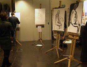
The life drawing component of the foundation course consists of six evening sessions. I expected to be a lifeless limp rag after the day of "crating" and book-presentation excitement, but once we got drawing, the energy came - I suspect the attitude and expertise of the teacher had a lot to do with this! Also, a spacious, quiet room. The life drawing session is meant to be a "safe place" for everyone.
First, an hour-long pose in which we could do anything we wanted. After that, we followed directions.
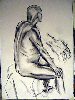
In the cold light of next day you're finally detached from your drawing and can see what "needs attention" -- that arm, especially!
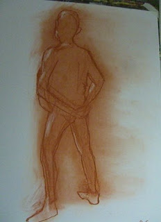
My favourite part of the class was the moving around to the next easel, rubbing out what that person had done, and doing it "your way" on top of the vestiges of that drawing. We did that 3 times and got to claim the final one as "ours". This was about two things - not being precious about your own drawing (or your preconceptions), and about seeing the figure from different perspectives - not only physically as you moved round the room, but psychologically as you looked at and reworked the previous drawing.
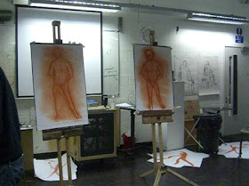
On the floor are the "gesture drawings" which preceded this exercise.

19 February 2009

Sculpture class, week 7

"Contextual studies" day - formerly known as Art History. This consisted of a quick run through the history of modern art in the morning - interactive, in the sense that we discussed various topics in small groups. Here are the causes and effects of the Industrial Revolution:
(the advent of the camera, and new paints, caused a revolution in the materiality of painting and one style building on another). Another exercise was for each group to pin the label on the painting - cubism was easy, but what exactly was/is post-impressionism?
In the afternoon, a visit to Tate Britain - Our mission: find at least three paintings and look closely, think, write.... I chose Zoffany's 1770 "Mrs Woodhull" for the pre-1820 era of Renaissance ideals in painting; David Bomberg's 1947 "Tregor & Tregoff" for pre-1970; and couldn't resist John Latham's plan for a monument at a derelict site in Scotland, "Five Sisters Bing" (1976) - a bing is a slag heap.
Afterwards there was time to visit the "Drawn from the Collection" exhibition, which has been extended till 1 March. Marvellous works spanning 400 years. Among the contemporary artists, I was bowled over by the "Roaring Forties" chalk drawings on blackboards by Tacita Dean.
There's no better way of looking at drawings than by copying them - here are some details of works that struck me -

16 February 2009

A Triumph

A vintage visitor to Wrentham Avenue - love that shiny yellow.

From the library - The Figure in Clay

Since doing the clay self-portrait head in sculpture class, I've been much more interested in figurative sculpture. That little bit of awareness of what goes into it, how it might be done, has spurred to find out what people have actually done. This book covers the topic from earliest times to the end of the 20th century. Among the contemporary ceramicists, Glenys Barton's "Listen" is show. She's quoted as saying, when she took stock of her work in 1977, "Drawing from life is the only activity that I'm allowing myself as I feel that it will take me back to essential and basic considerations." The drawing was a means of searching out a more abstract level of thinking, and resulted in some austerely beautiful images -

Helen Ridehalgh comes from a fine art background, rather than craft background. She starts by making a study in clay modelled from life - a bozzetto - then builds up the sculpture with thin, small strips of clay. This is Male Torso, 26 inches high -

Michael Flynn's "Catching the Cock" is a recurring theme with a multitude of references, to be interpreted by the viewer -

Mo Jupp's iconography is female; his forms are often cut off at the knees, and headless and armless, concentrating on their sexual attributes. "Grey Form" is 2 feet tall -
Many of Rosa Nguyen's hand-built animal sculptures approach life size, such as "Red Cow, White Cow". The marks left by the wooden slat that is used to beat the head or body into shape add to the energy of the piece.
Other artists illustrated in the book include Claire Curneen, Christie Brown, Pamela Leung, Anna Lambert, Christy Keeney, and Dierdre McLoughlin.

15 February 2009

When in doubt, make a book

The results of the two drawing classes that were spent playing with mixed media are now happily together in book form. At the front, the first session's papers are back to back, held by folded strips sewn to tapes which are glued to the covers. At the back, the session focusing on "a state of mind" -- intent -- an accordion book which was quicker to make than it would be to explain.

At the moment I'm almost caught up with the homework - a situation that could change....

14 February 2009

For sweet hearts everywhere

(from the posh cake shop in Muswell Hill)

Gallery hopping

A morning on Cork St, being exposed to all sorts of art. This is the work of ceramic sculptor Glenys Barton; her show is called Dancers and Angels, and includes a wall of small rectangular raku(?) plaques each with a different head in relief.
Nearby, the shaped canvases of Trevor Bell - and leaflets advertising his new book -
Around a corner or two, Sara Haq's installation chronicles her overland journey from Moscow to Bangkok, via Beijing. Ah, those endless snowy forests -
Also notable, the work of Stephen Chambers (he too has a new book).