06 January 2013

Hungarian photography

An excellent exhibition at the Royal Academy in July 2011, it included familiar names like Brassai, Capa and Kertesz, and unfamiliar ones - Kata Kalman, Gyorgy Lorinczy, Martin Munkacsi, Károly Escher, György Kepes, Rudolf Balogh, Stefan Lorant.

You can read the article from the RA Magazine here;  why did this wealth of talent come out of Hungary? It's to do with Hungary's tragic history in the first half of the 20th century - loss of territory, economic collapse, and isolation. But more importantly, "these artists were rapt attenders to the ‘music of what happens’ " - and interestingly, most of the Hungarian photographers living in exile elsewhere never managed fluency in the adopted language, but looked to photography for their narratives, a language of images.

Hazy-grey

The grey weather continues - it's winter, after all. The bare trees are probably my favourite thing about winter, none more so than these pollarded plane trees, with their "witches fingernails"-
The haziness in the photo above is provided by the dried rainspots on the bus window; in the photo below, it's due to a bit of fog, which thankfully is rare in London since the Clean Air Act 1956, which was passed after the Great Smog of 1952.

Art education

Put the action where your art is - people want to know
When we are immersed in the art-making world, we forget that the majority of people have had no art education. They know what they like, but can't say why -- because they don't understand the process of art-making and lack a descriptive vocabulary for what they see. So they ask annoying questions like "how long did that take you to do" - because they genuinely want to talk about the work and are interested to learn how the artist made it.

Yet many artists get impatient with these repetitious questions from the public. Commentators on Alyson Stanfield's  post on educating the audience have said that they find they can talk with enthusiasm about what inspired the work and about the processes they enjoy -- and surely this is true education to a receptive audience.

This was happening all over the place at Art in Action, and it was great. But then, the artists chosen to exhibit at Art in Action are specifically those who are willing and able to engage with the public - for four days straight - no mean feat! Much easier to blog about it, at leisure...

One artist who blogs about the process, principles, thinking, and history behind his work is painter James Aponovich. He says "most art is not entirely successful; it only points the way for improving on the next attempt."
Study for "Tasimento Artichokes" by James Aponovich (image from here)
Is this sort of education "spoon feeding"? Or is it a case of "when the student is ready, the teacher appears"?

The eyes have it

Making "portraits" out of cloth is a process that amazes me. I've not tried it, and have no idea of what's involved - or where to start. This one made me stop and look hard -

What would you say about "Green Eyes" by Jim Hay (this is a detail)? I love the use of colour and the many, various little bits of fabric. It's a stylised face, and making it in cloth rather than painting it stylises it at yet a further remove from "reality" - but you look into those compelling eyes and get a bit uncomfortable... So, it communicates; but what is it saying ...

Jawlensky's portraits come to mind (and - completely different! - Deidre Scherer's portraits) -
Alexei Jawlensky, Mystic Head, 1917 (image from here)
The "Green Eyes" image is from the weekly SAQA bulletin and advertises the Battle Creek Artist Guild Group Show at Olivet College in Michigan, which is on from 17 Jan to 12 Feb, if you're in that neck of the woods. See Jim's  work on the web at www7.wind.ne.jp/jimhay, where it says: "Jim Hay is an American artist dealing with the limited working space of his small Japanese house. Kimonos and easily rolled up scrolls point the way toward fabric assemblage as a solution suitable for our global village. It is clean, needs few tools, offers all the colors of the world's cloth and can be rolled up for storage and easy shipment abroad."

More green eyes in art:
Henri Matisse, The Girl with Green Eyes, 1908 (available here)
"Matisse's Girl with Green Eyes" in recycled tin, by Barbara France (from here)
Another Jawlensky, Young Girl with Green Eyes, 1910 (available here)
Green eyes in Pop Art (here)
Make-up Box (The Green Eyes) by Ion Tuculescu (from here)
mixed media by J B Wynne (from here)

a very famous image by Steve McCurry
So many cats have green eyes - I had to include just one image -
Two Cats with Green Eyes by Popo Iskandar (from here)
Other green eyed-things include  fairy-tale princesses, some of them at least ... and things that go bump in the night ... and extraterrestrials ...
Nostalgic?? They think so...

05 January 2013

Colours of the decade


(image from here)
Color experts Pantone have a color of the year every year.  Here you can see how Pantone’s year picks reflect (or were reflected by) colors that appeared on fashion runways.

Which year reflects (or is reflected by) your wardrobe? I seem to have quite a bit of 2002, among the 49 shades of grey and black that make up the contents of mine. Time for an upgrade? there are still a few days of The Sales left, with Final Reductions now available. 

This spring's colours include emerald and poppy red; last fall's colours don't seem all that different ... but a nuance means a lot, colour-wise (signature colour for fall was "fiery orange"). -
(image from here)
(image from here)
And the colour of the year for 2013? Emerald (from here) -

"Emperors" and their clothes

In last week's Sunday paper, I loved this bit of  verbal dexterity by David Mitchell ("Here's a look back at the year still to come"). It's so dextrously tongue-in-cheek that you may have to read it twice...

The Real Full Monty fetches £2.3m at Sotheby's

In a sale of film memorabilia, the no clothes the cast of hit Britcom The Full Monty wore at the film's climax were the star attraction. There was some controversy when the winning bidder said he thought he was buying the clothes the metal-workers had discarded earlier in the scene. "I'd wanted to get my hands on Robert Carlyle's pants," complained the anonymous millionaire. A Sotheby's spokesman clarified: "This lot isn't the clothes they weren't wearing at the end – this is the no clothes they were." Asked if it was a bit "emperor's new clothes", he said that "couldn't be further from the truth. That emperor was a nude man claiming to be wearing clothes. The absence of clothes in this lot isn't something we're denying – it's something we're celebrating. This is a chance to buy not only a unique, and easily storable, piece of film history but also a share in the very concept of nudity."

Some of the no clothes worn in the film (detail)

Art I like - Gillian Cooper

The labour of production? From a 2001 exhibition called Transition, at Newlyn Art Gallery.

That is the Cornwall Gillian Cooper - "Cooper now (2010) works from an artist's studio at Trewidden Gardens, Buryas Bridge, west of Penzance. Her semi-abstract paintings, drawings and limited-edition prints illustrate transitional moments and metamorphosis in landscape. See www.nsanewlyn.com for further details. She also offers workshops to individuals and groups in a range of art subjects. See www.outofplace.org.uk and www.keap.org.uk in reference to workshop opportunities."

Another Gillian Cooper based in Scotland - one of her 3D pieces (from here) is called Un-natural -
Her work ‘the 37 steps’, an experimental series of projections on and through textile hangings, is based on the repetition of daily life.

04 January 2013

X marks

Ever wonder why we cross fingers for luck? The internet tells us ....

"Crossing one's fingers, by curling the middle finger over the index, is thought to bring good luck. This dates back to when crossed fingers were used as a gesture to ward off witches and others considered to be or possessed by evil spirits. It is also seen as bad luck to cross your fingers on both hands.
"Some believe that the gesture originates from pre-Christian times, due to the fact that in early European cultures, two people were required to use their index fingers to form the sign, one to make a wish and the other to support it. It was believed that the cross was a symbol of unity and that benign spirits dwelt at its intersecting point—to wish on a cross was a figurative way of securing the wish at the intersection until it came true. Over the years, the custom was modified so one person could make a wish on his/her own."

This line of inquiry led to some musing about using the X or cross as a symbol. It has many meanings ... various Christian crosses, of course, but others besides ... cross cercelée in heraldry; the Jolly Roger pirate flag; the summit cross (Gipfelkreuz); the Nordic Cross of Scandinavian flags....

And there's cross stitch, counted and otherwise. Old dictionaries of stitches contain many varieties of cross stitch; these are from a 1934 edition of Mary Thomas's Dictionary of Embroidery Stitches, with clever pictorial puns by Miss Margaret Agutter, who also did them for Mary Thomas's Knitting Book. (Apologies for the splodges; my camera desperately needs its sensor cleaning.)
Cross stitch on canvas; cross stitch (on material) "also known as sampler stitch"

Chevron cross stitch; crossed corners cross stitch (see Rice Stitch); diagonal cross stitch; double cross stitch
Half cross stitch; long-armed cross stitch;  marking cross stitch
Montenegrin cross stitch ; oblong cross stitch; reversed cross stitch; two-sided cross stitch
Two-sided Italian cross stitch (also known as arrowhead cross stitch, italian cross stitch and two-sided italian stitch)
Some modern uses of cross stitch - click on the links to see photos -
Evelin Kasikov (there's an article on her in the July-August issue of Embroidery magazine)


or, urban cross stitch ... kits with a difference - http://www.urban-cross-stitch.com/

Plenty of subversive cross-stitch sites are listed at http://www.xmarks.com/site/www.subversivecrossstitch.com/

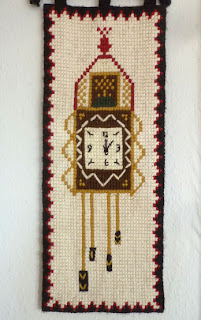
My mother loved to do cross stitch, and I love this "silent" cuckoo clock she made at my request -

Art I like - Fred Herzog

Fred Herzog's "Old Man Main" is in the "Cartier-Bresson: a question of colour" exhibition at Somerset House (till 27 January). The entire show is well worth seeing, but Herzog's work strikes a chord with me because these photos were taken in Vancouver at the time I was growing up there, and they show things I didn't notice at the time, as well as bringing back a lot of other memories from that era. Like these houses (image from here), now replaced by high-rise apartments, hiding the North Shore mountains -
Herzog and West End from Burrard Bridge (1957)
Apart from my nostalgic links with these pictures, they are amazing images. This article has a selection, including this staircase -
You need to look at other photos to get an idea of the range of his palette; the colours are unlike those you get with digital photography.

Photo-flaneur Herzog has been using his camera since the 1950s and currently has 85,000 images.

Found art Friday


03 January 2013

Weaving "memories"

The dark squares are getting their "memory texts"-
It's interesting to see what the random process of cutting the newspaper page into strips provides in terms of words that could be part of a story - a story that readers have to puzzle out for themselves. Sometimes I use colours that have appeared in the pictures, but mostly it's about the weaving of some sort of story out of whatever words come up.
I'll add the hand stitch (with red thread ... the "red thread of connection" ...) while watching television or travelling on train or bus.

Working on two squares at a time means the sewing can be run-on, and that the two squares have "stories" that are connected, from using the same set of strips.

Does inspiration ever arrive?

(image from here)
imho inspiration is not the prime mover;  "showing up" -- putting that foot out the door --- wins every time. It's a matter of getting going - making something/anything - thinking with your hands ... and then the inspiration comes.

Perhaps we should remove that word "inspiration" from our vocabulary. What does it mean?


  • The process of being mentally stimulated to do or feel something, esp. to do something creative
    • - Helen had one of her flashes of inspiration
    • - the history of fashion has provided designers with invaluable inspiration

  • The quality of having been so stimulated, esp. when evident in something
    • - a rare moment of inspiration in an otherwise dull display

  • A person or thing that stimulates in this way
    • - he is an inspiration to everyone

  • A sudden brilliant, creative, or timely idea
    • - then I had an inspiration

  • The divine influence believed to have led to the writing of the Bible

    • The drawing in of breath; inhalation

      • An act of breathing in; an inhalation


      • From those definitions, I think we're talking about no.4 here -- being struck by The Muse or whatever. That's the meaning I'm talking about eliminating. Yet there are other definitions (some are nuances?) that I find less irritating. The "drawing in of breath" (no.6) - that could apply to being in the studio and getting inspiration - from the repetitions and the ambience, as we repeatedly draw in air to keep us alive. OK, maybe that's a metaphor toooo far!

        Probably something will sneak up and say, "I'm here now, please pay attention to me!" rather than be presented on a platter by The Muse, don't you think? Though sometimes there are those Wonderful Moments when not only do you have a good idea but time stands still, and within 5 or 10 seconds it all falls into place and you go away and Just Do It and it really does work out .... and all the time you're working on it you feel so calm and happy. That's happened maybe twice for me, how about you'all? Did it come out of the blue or was there a sequence leading up to it?


        Reminder system

        If you constantly wear jeans you might want to try this idea, which I found in one of those organising email newsletters (one version of escapist reading...).

        "When I worked away from home, many things would come to mind while I was working, that needed to be done and I was rarely near my purse to find pen and paper. I started carrying a packet of 3 x 3 sticky notes in my right hand pocket along with a pen.

        "When I would think of something, I would stop, write my note, pull it off, and fold it in half so the sticky stuck to itself, and then placed it in my left hand pocket. When I got home from work, I would pull out all my notes, write them down in the appropriate places (like my calendar or planner) and stick the notes to the bedroom mirror. As I completed the tasks, I would take them off the mirror and toss them."

        Maybe you won't want to have the mirror cluttered with sticky notes ... but the portability of the small pad, and the little habit of checking the left pocket, those aspects certainly appeal to me, even if I'm only in the next room rather than "away from home".

        02 January 2013

        Recreational punctuation

        One for the editors ... from here.

        And if you work with punctuation for a living in any way, and have access to the BBC iplayer, have a listen here for a programme on stenography. The section on Hansard (which reports what went on in Parliament) is enlightening.

        "As courts around the world replace human stenographers with digital recording systems, Michael Rosen explores the ancient art of stenography. Michael looks at the work Charles Dickens did in London courts around 1830, and asks how his career as a shorthand reporter influenced his work. He investigates the mysteries of modern stenograph machines, and talks to people who operate them and to a leading barrister about the different ways we record words spoken in trials and other official proceedings."

        Her dark materials

        The new project - the "memory quilt" - is coming along. Sorting in the weekend studio found lots of dark fabrics, which I've been gathering since doing a "disgraceful discharge" course with Bob Adams years ago (2007) at Festival of Quilts -
        With the room tidy, it was time to start. My first thought was to stitch down the newspaper strips, then put fabric round the square, but that ragged edge needed to be left. So I sewed some strips round a square of dark fabric, and applied the strips to that, using red thread instead of black -
        More experiments with applying the newspaper strips to different sizes of squares, during which I tried ripping the paper during the sewing, and leaving some strips loose to be held down with hand stitch afterward (maintenance often involves mending, after all). Also with interweaving -
        Interesting how some words jumped out, or happened to be on the strips in the first place. Pure accident, that orange strip (2nd left) which says "dad and me". I'm tempted to look for useful phrases, but that could be frustratingly unproductive - Plan A is to leave the details up to chance, but to use sections of the newspaper that are likely to have "memorable" words - the Family section, and the Travel section.

        It didn't take long to make a few squares to be getting on with, some with bright centres and some with bits of brightness to be added under the strips of newspaper -
        Perhaps the colours (representing the emotion that underlies memory) will be too bright or distracting. In which case........

        Bit of a dust-up

        After a flurry of pre-xmas making, the "weekend" studio at Tony's needed a tidy-up. In fact it, like the studio at home, needed some serious consideration of what to keep and what to release.

        I was pleased to clear the floor space in front of the shelves -
         (it went into an area of the room out of sight of the camera) - and then it was time to tackle the area with the cutting mat and my frequently-used supplies. It always looks worst before it gets better -
        Not every box has been searched through, but things that have emerged include a "Linus quilt" started three or four years ago -
         and some "journey lines" pieces from two years ago -
        They are in my "finish and donate" section. But since starting this clearup and tossout, I've got going on the "memory quilt", which led to a further detailed sorting to find suitable fabrics.

        I'm thrilled to get to this stage -
        Room to cut, radio on, and ready to sew! (And those shelves are looking less ragged as well.)

        01 January 2013

        Resurfacing

        Found in a pile of to-be-sent-someday greetings cards - "Night Wanderer" by Saara Tikka was bought in Helsinki at least 10 years ago.
        The wolf in the northern night - a good theme, related to fairy tales and oral traditions.

        Though her painting style is sparse, it conveys things-not-quite-there. (Also it looks rather like it could have been stitched, rather than painted.) See more of her art here or here. All I've managed to find out about her is that she's from North Karelia and has illustrated "The Journey of Pietari and his Wolf".

        Art I like - Gabriel Lalonde

        Les Simples Écritures / 2 ; 35.6 x 43.2 cm; 2012
        Abstract calligraphy. Gabriel lives in Quebec City and blogs at gabriellalonde.blogspot.co.uk