
20 April 2012
The clothness of cloth
Book du jour - meeting the eye

The book has 14 sides available for text, and each side takes 10 minutes to fill. I wrote down some rules for this book, including: no paragraph breaks; cross through for mistakes, but don't insert missing words; break words anywhere without hyphens; if text runs out before book is full, start again at the beginning; be aware of posture; try to remember what's been read/written.
This was done over three days, and the writing at the end is much closer-together than it was at the beginning -

Spacing in text
" Identifying space as verbal art is a technique used by Woolf; in novels like Jacob’s Room or The Waves, Woolf was in constant dialogue with the printer, ensuring that the spaces between scenes were of a precise thickness. The absence of words, or the space in between scenes, becomes another source of meaning; space becomes verbal art in the same way in which Woolf practiced a linguistic art."
The absence of words as a source of meaning .... "nothing is something". The words are a thing, and the space they occupy - or leave empty - is also to be "read" as a thing.
More than meets the eye.
Again, one thing leads to another, and in trying to find a picture to break up the run of words, I came across this:

" Woolf’s use of spacing, variant punctuation, and emphasis on words as single, constitutive units, exposes the printed rectangle of text on the page as a form of meaning, one as important as the narrative itself. For example, Woolf breaks up the shapes of words in order to replicate spoken language—how stress is placed on single syllables. When Archer calls Jacob, he shouts: “Ja—cob! Ja—cob!” and when Mrs. Flanders summons the two boys, she calls, “Ar—cher! Ja—cob!” Woolf’s separation of their names in this manner renders it difficult for the reader to avoid the physical shape of words. Yet Woolf exposes the paginal skeleton even further: two lines of space separate these initial shouts, secluding these broken syllables from the rest of the textual body. Indeed, throughout Jacob’s Room, Woolf experiments with spacing; four lines of white space separate some paragraphs, while other paragraph separations are thinner. Woolf, therefore, in structuring the book according to the spaces between scenes, not only considers the visual composition of the page but also how the absence of words—as indicated with blank space—becomes another origin of meaning. "
19 April 2012

18 April 2012
Meteorites
(1) Cornelia Parker's meteorites - I've written about them before, and there's an interview with her about them here - where you can also see a sparkling video of an arty firework display -


(2) Famous English meteorites - two are on show in Patrick Keiller's show at Tate Britain. One fell in Oxfordshire in 1830 and the other, larger one, in Yorkshire in 1795 and is commemorated by a monument. Before then, stones falling from the sky were thought to be a fiction, and this stone, seen falling by several people, provided evidence that they were real.
This is neither of those - it's the Wigan meteorite - read about it and other historical meteorites here.

Wonder what Henny Penny would have thought of that one...
 |
| Image from here |
Passengers
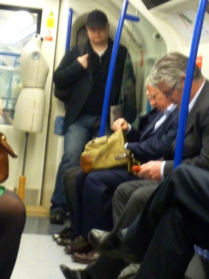
Turning the other way in the carriage, this sight -


17 April 2012
Pieced paper
Where did the urge to sew paper together come from? It's been lurking for a while, and after seeing Matthew Harris's folded-over-and-stitched seams, I wanted to try that on paper. Which might have been fine if I'd stuck to just that one thing --like at the top in the photo-- but no, I started to add slivers of text and before you know it, something like that gets out of hand and you wonder why you ever started. But following the advice of Idris Khan, I kept on till the end. Which brings us to the famous dictum: "Perfection is achieved not when nothing more can be put in, but when nothing more can be taken out."


This has possibilities for being double-sided, with some seams on each side. And interesting edges. Perhaps using slivers of colour, not text/texture. It's also interesting against the light.
The paper is japanese paper from a roll. When sewing paper, the seams much be absolutely straight - unlike fabric, the paper has no "give" to it. (Overlapping and gluing is easier!) So any hand stitching is best done as you go, before the area becomes unreachable. Thinner threads seem to work (look) better than thicker ones.
When it comes to sewn paper, Carole Bury's pleated tissue paper is superb - see her work here. I also recall a paper quilt by Margaret Anderson at FOQ involving squares (recycled envelopes?) with appliqued houses, with monoprinting and machine stitch, but my photo seems to have been lost in one or other computer crash.
 |
| Maps and kitakata paper used here. |
Mike Cloud's Mick Jagger "paper quilt" (from here; he talks about it here) - this combination of found photos plus painting plus lettering has many possibilities -

Susan Stockwell's Imperial Quilt (from here) -

A collaborative Paper Quilt Project was shown in Berkeley in 2011: "This project revives the social and participatory nature of quilt making among contemporary artists who might normally work alone to join forces in a shared experience."
This is NOT from the house quilt I've been searching for - it's by Mirjana Farkas -

It came up on my seemingly-endless paper quilt search, and seems to be a sign that it's time to stop searching...
16 April 2012
Sky - in woodcuts


15 April 2012
Book du jour - a punctuated journey
In the sleepless reaches of the night I had an idea about taking the words out of sentences, paragraphs, pages, books... and leaving only the punctuation. These examples are from "Owl" by Desmond Morris.

Towards the end I was thinking about how to space out the punctuation - or rather, include the word spaces as part of the punctuation. And then I started thinking about how different authors - or different genres, or different literary eras - might have different "punctuation journeys". And that sent me to sleep...
The idea seemed worth a try, so I took a book almost at random, which happened to be A Stranger at Green Knowe by Lucy Boston, and opened it almost at random and started reading/writing, using 6B graphite -

 |
| Too faint! |
Inky
A comparison of chinese ink, kandahar drawing ink, indian ink, japanese ink - over splodges of coloured ink and graphite lines. The line shows through the ink, to various degrees, and can be "polished up" (middle lines). Japanese ink is the densest, and left to dry is quite a golden colour. The drawing ink is insipid. It and the chinese ink smear when wet.


14 April 2012
Watching ink dry
Making this little book (as yet untitled) involves spraying the pages - one by one - with water, then touching the water droplets with ink. Some spread into each other, others have just about dried before you get to them. Then the ink has to be left to dry, and this can take hours (using a hair dryer risks spreading the ink). So I've been doing a page every morning, and have nearly come to the end of the book.


Constellation charts
 |
| Corvus |
 |
| Eridanus |
And as for star charts - so many different ones! This is from here (so many astronomers...) -

13 April 2012
Colour balance

Rain poem

And here (from his blog) is the painter (signwriter Gerard Brown) painting another -

Book du jour - reusing a dictionary

While I was tearing them out, one by one, the headwords continually caught my eye. My first attempt at recycling the dictionary words uses the page TIGRESS to TITAN. The words look a little lonely on the page, a little purposeless without their definitions. The cut-up page is not without interest, though...
To stick the words onto the page - they are tiny! - I sprayed the back of the dictionary page with 505 (repositionable) spray, then cut them with a scalpel and lifted them into place with the tip. The sheet of paper had been scored with parallel lines to help placement.
Rather than doing more "big pages" like this, I'll fold them in half and do a dozen or so to make a "proper book". My original plan came from the "line as text" idea, and was to sew through the middle of the words with fine thread to hold them on the page. That might be tricky with words on both sides of the page, as I envisaged when thinking of a "proper book" ... but having the words just on the right-hand page means that the left-hand page really would have "lines as text".
(Two days later....) The words are glued onto graph paper, which makes it easier to align and position them. One dictionary page fits onto one graph-paper page -


12 April 2012
Art I like - Idris Khan


The words are stamped on (that's a lot of stamping!) with oil paint - again, this represents the throwing of stones against the pillars - using stamps to stamp out feelings -


Waiting for the artist to appear and tell us more about his work -

Some of the meat of the evening was in his generous responses to questions. What sticks with me is: to keep making work you believe in - understand what it is before you show it - take it through to the end, even if it doesn't work. Also, he believes that "the first thing the viewer wants to see is a very beautiful image." Yes!
"Lines of thought"
In a warehouse beside a canal is the Parasol Unit, a foundation for contemporary art. You ring the bell to be let in and find a nice place to sit and read the catalogues -
 Out back, shared with Victoria Miro gallery next door, is an oasis (complete with crow's nest) -
 and pond with Yayoi Kusama's floating mirrored balls, which drift in the wind and clink together softly -
 The Lines of Thought show, which is on till 13 May, has works by 15 artists from the 60s to today - Helene Appel, Hemali Bhuta, James Bishop, Raoul De Keyser, Adrian Esparza, Özlem Günyol & Mustafa Kunt, Sol LeWitt, Richard Long, Jorge Macchi, Nasreen Mohamedi, Fred Sandback, Conrad Shawcross, Anne Truitt, and Richard Tuttle.
The exhibition continues upstairs -
 My favourite piece, by Jorge Macchi, who has also done some tricky things with maps and words and suchlike -
It's hard to put into words why I find this piece so satisfying -- but hey, that's why I'm blogging, to know what I think when I hear myself talk! So here goes...
What I see [let's start with the easy bit, the description] is a postcard of two equal-sized blue rectangles - presumably the sea and the sky. Immediately their meeting point becomes the horizon. Metal springs hold the piece to the wall -- suspend it in tension, hold it in suspense against the wall, both extending the horizon line and making it finite -- but because the springs are coiled, they hint at the infinite extent of the horizon, if only they could be drawn out far enough to make them as straight as the line they are joined to. The horizon connotes a definite demarkation, yet an unattainable place -- it's always moving ahead of you. Sometimes, for instance when you are in a forest, it disappears. The horizon could be seen as a non-place (you can't actually go there), and yet it's not nowhere. The metal springs seem to me to be torturing the very concept of the horizon, putting it on the rack, making it fit the rack-master's idea of truth. Alternatively (or perhaps, "also") the message could be that a horizon can be as wide as you want. It's up to the viewer to decide.


 |
| Partial view of ground floor; image from here |

 |
| Image from here (..."poetry and mystery meet") |
What I see [let's start with the easy bit, the description] is a postcard of two equal-sized blue rectangles - presumably the sea and the sky. Immediately their meeting point becomes the horizon. Metal springs hold the piece to the wall -- suspend it in tension, hold it in suspense against the wall, both extending the horizon line and making it finite -- but because the springs are coiled, they hint at the infinite extent of the horizon, if only they could be drawn out far enough to make them as straight as the line they are joined to. The horizon connotes a definite demarkation, yet an unattainable place -- it's always moving ahead of you. Sometimes, for instance when you are in a forest, it disappears. The horizon could be seen as a non-place (you can't actually go there), and yet it's not nowhere. The metal springs seem to me to be torturing the very concept of the horizon, putting it on the rack, making it fit the rack-master's idea of truth. Alternatively (or perhaps, "also") the message could be that a horizon can be as wide as you want. It's up to the viewer to decide.
Subscribe to:
Comments (Atom)