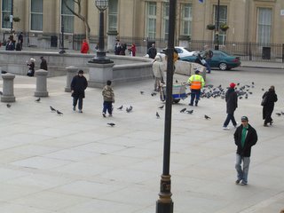
 those pale edges, those ruffly leaves...
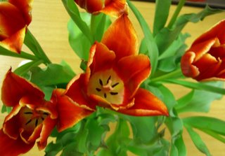 those dark accents in the centre. What delight.
 The lacy effect is made on tulle with bra elastic, embellished with the type of ribbon you might hang war medals from --
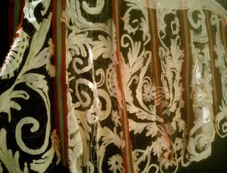 This next one is called Black Forest and has, along with the dancing bears, silhouettes reminiscent of those "cows going up the mountain" pictures -- and two long black stockings to act as pockets! See the whole thing, and better pix of the others, at http://www.r-h-g.co.uk/ under "western artists" then "Karen Nicol".
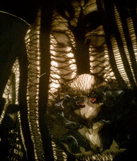 "Spot the Dog" was once a linen tablecloth. Karen made the cutwork on her Irish machine (it has a wide satin stitch, controlled by a knee lever -- and you can work very close to the needle to add in fringe, fabric, etc) -- she used a tighter tension so some of the black bobbin thread would show. The dog is at the front of the wrap skirt, and there are other motifs among the cutwork. Karen's birds are delightful.
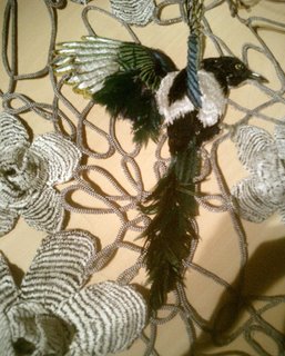 Karen said she trusts in luck and draws with confidence. "I always carry a little notebook with me -- and I get inspiration from everything -- it's something I think of all the time -- it's my big pleasure."
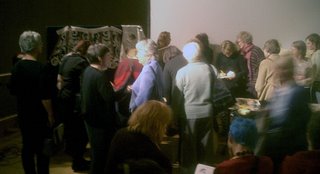 The speakers were Jehane Boden Spiers (www.yellowhouseart.com - Embroidery as Exploration), Jennifer Harris (the Textile Collection at the Whitworth Art Gallery - www.whitworth.man.ac.uk/), Karen Nicol (24/7 Stitch - see www.r-h-g.co.uk under western artists), and Jo Owen (The Influence of the Human Form in my Work - no pix on the web). The speakers were consistently excellent, inspiring - professional. And the room was full of textile enthusiasts - practitioners, explorers. Fabulous.
 Previously I covered the stripes with net to knock back the brightness a bit, but that didn't do the quilting stitches any favours. In this one the knocking back will have to be via the quilting.
 The other is by Bill Jacklin, one of my favourite artists.

 Took it round to Jean's for show&tell, and to see how Tricia, Traciy, and Jean were coming along with the challenge.
Took the other, which isn't quilted yet, just pieced, as well. It needs something on the right. That's Erik looking the other way. Tricia used hand-dyes for hers, and plans to make another. It has a controlled explosion effect --
 Jean has her fabrics chosen and ready --
 Traciy has just moved house (and painted every room) - and is ready to get to work in her new sewing room.
 Fabric possibilities - some commercial batiks, some biggish prints, some African tie-dyes, and some furnishing samples --
 Other fabrics. A more restricted range of possibilities --
 And now the (interim) results. This has grown to nearly 80cm square, and thereabouts it will have to stop.
 This started with a scrap left over from the other, and is about 60cm, and still growing --
 Neither is turning into a labyrinth. But there are many fabrics yet to use....
 Instead of lots of explanation on labels on the walls, you got a little booklet with a short description of the picture - enough to give you some information, not too much to be overwhelming. And interesting; to the point. Plus, space for making drawings -- not so much as a reminder, but as a way of looking harder, better at the picture.
 Here's one called "Repose" (not sure if repose is what's on her mind...) by John White Alexander, 1856-1915. The booklet says: "The theme of the idealised woman in an elegant interior setting ensured international success for Alexander in the 1890s. His familiaryity with contemporary French aesthetic taste is evident here. The sitter's sinuous curves and languorous expression are provocative and alluring."
 After hot chocolate in the cafe, we stood in the portico and took photos of people in Trafalgar Square.