11 February 2011

This week at college - lecture

Daniel Sturgis is head of BA Painting at Camberwell. He showed just one of his own paintings
and then went on to talk about the culture of painting, negotiating a position, resurgence of 1970s painters, and some curating projects he's been involved in. Chris has summed up the lecture here; my own take is to follow up some of the leads (and get lost in following up leads from those leads...) So I'll mention just a few of the exhibitions and artists mentioned in the lecture.

High Times Hard Times: New York painting 1967-75, a 2006 exhibition
was "a saber-waving, opinion-altering show, for the simple if thrilling reason that it posits an art-historical missing link. It’s composed entirely of abstract work made by painters who were born too late to be Pop artists or hard-core Minimalists, and who then tried to take the medium to less structured and splashy, more intuitive and experimental shores" - or so it says here (and you can see many of the works in it).

Before the end: the last painting show (2004) showed the final painting made by conceptual artists - before they went all conceptual (in the 1960s), entered the realm of ideas, and stopped painting. Those were the days when painting was dead - remember?

Now a list of names of painters, some from the 70s and some born in the 70s (or later):
Martin Barre (considered the precursor of minimal art in France) -
Bob Law (love those minimalist landscapes!) -
Jacob Kassay ("silver deposit" paintings) -
Olivier Mosset (who curated Before the End)

Finally a thought: Every a mark is made has a history (that some people know about) and will be a quotation of that history.

This week at college - seminar

The main purpose of Tuesday's seminar was to get moving on the catalogue for the final show - September will soon be upon us, or on the full-timers at least! Les got out the catalogues from the previous shows - such an interesting variety - and discussed some general principles: purpose, audience, content, format, alternatives, budget....
Among the catalogues from past shows were this foldy one -
another in which each person had their own page; this person put a negative in the envelope, which would degrade each time it was brought out into the light -
Part of this large poster was a list of 10 books Stephen Bury (who recently curated this book exhibition at Chelsea space) would have made if he'd been on the course -
Another poster, with one example of each person's work -
The seminar also included briefings about the mid-point review (in which the full timers put out their work and everyone comments on it) and the research essay.

Undercurrents


Silk boxes

The floppy one holds some throwster's waste - long strands of silk, very strong - gummed and unruly -The stiff one holds "moth holes" (synthetic fibre...) and a silk organza moth -
Various types of silk are available by post from George Weil (no affiliation, just a satisfied customer) - the website has a good explanation of what they are, or for more information about silk and other fibres, look here. I use the cocoon strippings to make paper for boxes, and for printing on, because it's so uncomplicated - no need to add paste, even.

10 February 2011

Reknitting

You can see where the dropped stitches are heading -
Contrary to popular fears, a dropped stitch won't go very far of it's own accord - about four rows down at most.

The cable needle was useful for knitting the stitches back up again -
A bit of pulling "on the bias" and it will be invisible.

Lovely little present!

Elegant teabags from Elica, whose book arts project is ... tea ... thank you, Elica!

The tea is Japanese, and has instructions in English:
Brew 1 teabag ...
in 150ml of hot - not boiling - water for 1min. 30sec. Moving the teabag back and forth helps release the tea's core components.
Remove teabag once desired strength has been reached.

09 February 2011

Year of the Rabbit

My friend in Xian, Min, says that this is the popular gesture this year to show regard and give new year greetings. The gesture looks like a rabbit, and when you move your thumbs it looks like the rabbit is wiggling its ears.

The Chinese character in the middle is 'rabbit' (tu), which is pronounced 'to'. So, "Happy to you" shows the influence of internet and English on Chinese culture - and it shows how Chinese people absorb cultural influences from elsewhere.

February sunset

The days are noticeably longer - and we've finally had some blue-sky weather in London! That's the Imperial War Museum in the background - it's library is up there under the dome, and there's a huge double-barrelled gun outside (see it here). Lots of art by war artists; well worth a visit.

08 February 2011

Composite animals

"Magic polar bear" by Jack Nuviak and Leo Napayok is a card from the National Gallery of Canada (thank you, Rita!)
The magic panther has been gracing a ring-binder for years; it comes from the Pierpont Morgan Library.

I've always wondered about composite animals and this post gives me a chance to find out more.

"These composites, made up of disparate elements (animal, human, demon, and so on) are found in India from the early Mughal period onward, giving rise to the Mughal label. The painters of the Mughal composites are able to invent composite animals which may startle us at first, but on close inspection seem so entirely natural. This sheer naturalness of many of these paintings is even more striking than the individual elements. The playfulness inherent in these paintings may mask some deep intent, but at the same time this playfulness is enough to keep our interest and inspire our admiration." says a site dealing with Indian art.

Lots more here, including this uncomfortable way for economy passengers to travel -
"In the Hindu tradition such paintings possibly represent the belief in the internal unity of all beings and illustrate the doctrine of the transmigration of souls through successive reincarnations... an effort was obviously made to stress the mystical and ambiguous relationship of man to the natural world."

Arcimboldo's composite heads are fairly well known (was he inspired to experiment with composite figures after seeing Indian minatures?) -
Another type of composite animal is the hybrid, found in Egyptian and Near Eastern cultures -
Kate Clark's unnerving animal "portraits" can be seen here - one of many modern manifestations. Even more unnerving are the cadaverous amulets of Sarina Brewer, here for example.

"Sculpture for Travelling"

Where would modern art be without Marcel Duchamp? Here's just one of his newfangled old Readymade inventions -
Bits of rubber (cut from bathing caps) that can be assembled (randomly - and extended with strings) into a sculpture, wherever you are. It was made to be recreated out of his suitcase at every stop during a voyage in 1918. For three or four years he had a number of these in his studio, so that the strings impeded movement around the studio ... very playful ...

Another of his "voyage sculptures" is a typewriter cover - an invitation to voyeurism (could you resist peeping under it?)

See the Duchamp image of the day here.

Artists can get away with anything

Or so it seems. The description of Duchamp's "empty" phial - or rather, the commentary about his approach to measurement - "the duality at the centre of his philosophy", indeed! - approaches, or perhaps exceeds, political spin -

"Paris Air also has a clear connection to the concept of measurement; it illustrates Duchamp's toying with the rules, or standards, of measurement. ... When reproduced on a postcard in 1937, Paris Air was identified as "Ampoule contenant 50 cc d'air de Paris." This title was mathematically inaccurate, considering the original version of Paris Air held over two times this volume of air. Typically, Duchamp embraced this inaccuracy; when issuing the edition of miniatures for the The Box in a Valise in 1941, he made sure to make them all hold 50 cc of air. However, when creating a replica of the original version in 1949 (because it had broken), Duchamp made sure to repeat the "original" size of the ampoule. This simultaneous embrace and rejection of measurement standards illustrates the duality at the center of the artist's philosophy for making art."

07 February 2011

Silk paper

I used the technique of teasing out the cocoon strippings on a layer of baking paper, adding "stuff" and another thin layer of cocoon strippings, spritzing it with water, putting another sheet of baking paper on top, and then ironing it dry. The cocoon strippings have serricin, the natural glue in silk - and that glues it magically together.

The additions are metallic organza on the left and gold embroidery thread on the right.
The gold thread on hand was 4-ply - when I started pulling one strand out, the rest curled up - nice - rather like writing! How to keep the loops? start by tying a knot in one end, then when you have enough loops, use the extra length of the single strand to tie around the other three.

I hope to do some screenprinting on these small sheets, and on other thicker ones yet to be made.

Art I like - Maud Cotter

"Magnetism is a new conceptual glue for me, it feigns volition, it has its own impish behaviours, and preserves randomness within the piece. I love working with it." - from an interview with Irish artist Maud Cotter, seen here (another, more recent, interview is here).
"Consuming Pool", based on the landscape of Iceland, is a 2D work from 20 years ago; she's mostly known for her 3D work, often using found objects that are chosen for their emotional and visual context.

Of her sculpture "Rumpus Room" she says:
"I was interested in the invention of a space that absented the order of the rest of the house, "a place where the house lets go..." Vincent Abbott (critic, 1935). The fact that such a form emerged in American culture in a period of recession interested me further. The 'letting go' bit interests me more than anything else, inventing a new function within an old form. Americans built a bar, had friends round, danced, watched home movies, played pool table, and generally engaged in activities that they normally did outside the home. I recognised immediately that this form provided me with a space frame within which to cluster ideas, a space with a host of flexible readings."

Another quote:
"My work fits into making shifts in cultural attitude. We have to start at a micro level to enact profound change on a large scale. This focus of realising the unused potential of material by changing the meaning and pattern we attribute to it, is an important part of my work."
"All Stuff is Farce", her latest book, includes the essay here.

Orange wrappers and other papers

It's blood-orange season, and they come from Morocco or Italy, sometimes gloriously wrapped up -
Most orange wrappers you see nowadays - if at all - are less exciting -
I started noticing, and collecting, orange wrappers in the early 1990s, after unexpectedly seeing an exhibition of Francesco Clemente's work at the Royal Academy (see and read about more recent watercolours here). It intrigued me and I bought Three Worlds; in Ettore Sottsass's essay, there is wonderful mention of paper, of the culture of paper - craftsmen in mills making special kinds of paper:

"all-cotton handmade paper, as they say, heavy, dry, granular paper that absorbs just the right amount of water, paper that lets watercolour spread and makes it transparent, or opaque; soft paper that can be picked up and laid on the table as if it were a religious instrument"

and

"that daily way of using paper, of holding it, throwing it away, burning it, pasting it, cutting it, honoring it, and despising it ... the culture that circulates in the senseless hours of days and nights, the culture of paper to be found in alleys and in trattorias, in train stations, at the grocer's and the butcher's, at the dairy and in the pastry shop, at the post office and maybe also in the ministries; certainly in army barracks and in the official gazette, but also in porno photofiction. ... In all these wide popular uses, paper, being expensive stuff, has to cost less and less, and so for popular uses the paper gets thinner and thinner and more transparent, grayer and yellower, more violet-colored, dirtier and coarser."

In Italy, until a few years ago [the essay/book was published in 1990] "packages were made with light, crumbly paper that was always too short, and Romanengo in Genoa, who used to sell the best chocolates in the world, made his packets with a blue, shiny paper, whereas butchers used yellow paper with dirty, very vulgar black spots on it, and sugar was put in gray-blue paper bags that were always falling apart, and fruit, lettuce, or tomatoes were sold in old newspaper. Almost all packets were made of newspaper; even your shoes mended by the cobbler, even books, even bread, was taken home wrapped in old newspaper; whereas for oranges there was a very thin paper printed with the growers' trademarks, which were always figures of heroes from a long popular dream: lions, tigers, Garibaldi, Aida, Othello, the occasional special dragon, gigantic snakes sometimes even printed in gold."

The essay goes on to talk about what happens to all these bits of paper when they get thrown away; I went on to amass orange papers, keep them safe (and to eat dozens of oranges a week) - in the back of a cupboard are about 500 different designs. I photographed a few when I first started blogging (five years ago!) - they haven't been out of the cupboard since.
Some orange wrappers from the 20s and 30s (found on the internet, source lost)

06 February 2011

Bunnies in the bread basket

Book spaces

Martin Richman's "book spaces" come in small or large, light emitting or light absorbing. I like the concept. Richman's work is informed by " the articulation of volume through the use of light and colour; a sense of play and experimentation; the construction of dreamy intangible spaces; the blending of the personal into the public; the interruption of the public with the private. ... He is interested in streetscapes, quiet alleyways, the bits in between buildings, the way people use those bits and how the interior life of buildings seep out on to the streets. Many of his projects are small scale, almost invisible, interventions into street life which go almost unnoticed. Painting and lighting a railway bridge in Bethnal Green is not the act of a great artistic ego - for Richman the important thing is to make a slice of life for a humdrum street which provides passers-by with an opportunity to engage with their city and their thoughts."

Advert plunders chemical icon

Since when was grocery shopping so "elemental"? The story behind the advert is here.

And if it's the "real thing" you want - plenty of versions to choose from here! This one is dynamic. This one has videos. This one is on the Royal Society of Chemistry website, complete with history. And there's a catchy song - Tom Lehrer sings it on youtube.
05 February 2011

Quick 'n' easy Photoshop


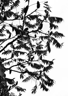
An image that might be useful for my "sky birds" project (are those feathers?) - as it came from the camera -

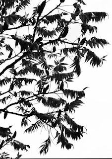
To simplify it, I made it monochrome (Image - Mode - Grayscale in Photoshop) and adjusted the Levels (control+L is the keystroke for Levels) by sliding the white slider to the end of the black hump and the grey slider almost to the far left. I didn't like the result -
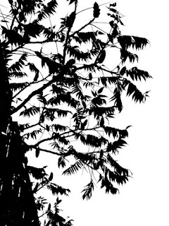
Using Image - Adjustments - Brightness/Contrast gives a much better result -
Both Brightness and Contrast are at the max - the sliders are over on the right.

Levels is the adjustment in Photoshop I use the most, but it certainly has its limitations.

Or maybe I use Crop more often than Levels? Just about any photo is better cropped...
A sequence of keystrokes I learned recently is useful to remove the building from the bottom left corner. Control+A selects the entire image, and Control+T can be used to "transform" it - hold down the Control key while dragging a corner.
Oops, I didn't crop the bottom carefully enough... (the keystroke for getting to the Crop tool is simply C).
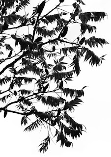
To remove the leaves in the lower left, click E (for the Eraser tool), make sure the background (the "set background colour" square in the tool bar) is white, and rub them away -
Erasing is quicker if you right-click to adjust the diameter. (I haven't figured out what "hardness", which can also be adjusted by right-clicking, is.) And rather than cropping again to remove that line at the bottom, I used the Eraser tool - one click at a time, in case I made a mistake, in which case Control+Z would undo the mistake.

Hah - I showed this to my son, who has been boning up on Photoshop. He went to my original monochrome image, pressed V then Control+J (to create a new layer), Shift and + or - to cycle through Blend modes, and Control+J till it was dark enough - took him less than 10 seconds!


Pressing

Two more discoveries

Oh my, what was I thinking? This piece - which is about a yard wide - was supposed to be "The Road to Hell" - it was bundled up with paper patterns for lightning bolts, but the people running down the road got used in something else (just as well!) -
It's big enough to form the basis for most of my JQs this year - the JQ size is 10" square. It would certainly be a challenge to make "something interesting" out of this piece - but doing it just as an exercise is pointless. "First find your concept" - !

The next discovery was part of my Luna project (a large, quilted moon surrounded by a lot of - 28, as it happened - quilted holes; can't find a picture at the moment...). The discovery has ancient symbols for the moon scattered on the shiny blue - a better starting point for a series of journal quilts, and it comes with the concept embedded in it. I've done a lot of moons over the years, and could probably find a way to tie the moon into "journeys" -
My challenge will be, in the rules of this year's JQs and more importantly in the context of my Journey Lines project, to have a circle in the first four JQs, text in the second lot, and finally - buttons ... how on earth do buttons relate to the moon? (as stars, maybe...)

One of the advantages (or disadvantages) of being disorderly is that one is constantly making exciting discoveries. --- A. A. Milne (quoted in the Get Organized newsletter)

"Enclosed"

Installation by Anouk Kruithof (found via the bookshelfporn site) - see more about it here. (The video is very slow to load, on my browser at least - but 30 seconds in, things start to happen...)

04 February 2011

What's in a book?


A bit of biblioclasm by Jukhee Kwon, currently on display at Camberwell College library.