One thing leads to another.
Searching for a sketchbook with blank pages, I started looking through the pages of the first one that came off the shelf ... and noticed how the strong sunlight would pass though several pages, even thick pages, at once, if the marks on them were dark enough.
Out came the camera, and then the photographs of the layered pages got a bit of tweaking in photoshop, starting with a simple conversion to Grayscale, and then trying out some filters.
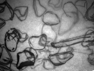 |
| Greyscale |
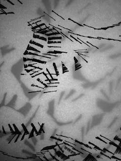 |
| Different qualities from different sorts of mark |
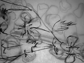 |
| Too realistic? |
 |
| Using the Underpainting filter |
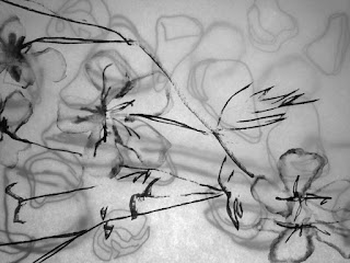 |
| Dry brush filter (under "Artistic" in the list) |
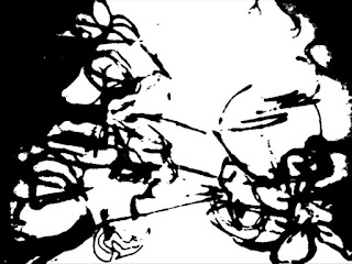 |
| Using the Cutout filter |
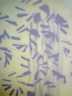 |
| Not grayscale |
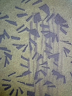 |
| Poster edges |
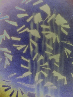 |
| Solarize |
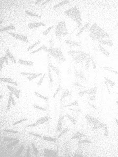 |
| Graphic pen |
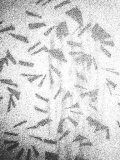 |
| Graphic pen with Levels adjusted |
From even this short experiment, it's obvious that some effects work better than others. There are so many options in the Filters, and so many adjustments possible in each ... it's overwhelming. How do people find the ones that are most useful - how much of a learning curve is that?
Hit and miss has revealed Solarize and Cutout as worth trying again, if only to quickly see what sort of effects are possible ... before getting out the ink, brushes, pencils, scalpels and taking it forward the old-fashioned, manual way.
You could, of course, combine separate photos of marks on screen by using Layers. Getting to grips with Layers is on my list, but not near the top of it.


2 comments:
How fascinating these are - I knew I'd been away from your blog for too long! Those first images remind me of asemic text. The translucency is lovely.
Thanks to your recommendation, I'm now halfway through the Pixeladies Photoshop Elements courses, having finished course 1, so seeing how you've used it is most interesting.
And adding another thought - the Pixeladies explain layers most excellently ...!
Post a Comment