31 December 2010

Before and after

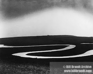
This is the Cuckmere valley - long ago I made a quilt, largely with black net, based on Bill Brandt's photo of this scene. Then one day we got in the car and looked for the scene shown in the photo.

Just the other day, driving home from elsewhere, we suddenly came across the scene again - I got some shots out the car window. You'll agree that the foreground was very dark in the original: a digital camera will insist on doing this, trying to "grey" the colour in the entire picture.

Thanks to the Gradient tool in Photoshop, however, the foreground can be lightened and the sky kept its original colour. (I've just learned how to use this, and very useful it is!)
Now have a look at Brandt's photo, and how well (and subtly) his foreground works -

For the birds

One of my Christmas presents was a book of postcards of Inuit art birds. "Bird Song" by Nikotai Mills (1936-2003) is my favourite -
closely followed by Kenojuak Ashevak's "Many Young Ravens" (rather untypical of her style) -
Back in the UK, some birds on London Underground posters -
"Seagulls on the Thames" by Edwin Noble, 1916, is on the posters website, but seemingly not the one with crows.

Boekie Woekie

Amsterdam's artists book store was on my list of places to go. It did not disappoint; from the 7000 titles carried,I had a hard time choosing just two books; "Quiet Amsterdam" by Siobhan Wall (who is working on a book of "Quiet London"), and another that went elsewhere as a Christmas present.
In the window beside the door, this notice:

Journal quilts, 2010

This year the Contemporary Quilt journal quilts were 7"x10". I liked that size. It seems I've made 23 this year - and there's a dark red one lurking in a bag somewhere, I just haven't come across it lately.

Towards the end of the year I really got into the "abstract landscape" theme - these are the recent ones -
My screenprinted TravelWriting has found its way into some JQs - especially this one -
A couple of earlier abstract JQs are here.

30 December 2010

Beautified laundrette

On Blackstock Road, north London - dressed up all pretty for Christmas. Shot through the car window, while stopped in traffic.
What caught my eye was the "Shirt Service" sign, which the magic of Photoshop makes legible (well, just about) -
The photo also shows that rare thing, a working clock!

Down the garden

Lovely little old shed at the bottom of a garden - forget where I saw this, but it's just the place for a (summer) studio...

Photography in the landscape

Kurt Tong recently had an exhibition of photographs of Chinese joss-paper objects, made to be burnt, at Compton Verney (photo from here). On his website, you can see another interesting project, called "22 steps to the sea", consisting of photographs of the rapidly-eroding Texas gulf coast.
He had planned to spend six weeks photographing, but cut the trip short after being stopped by various "officials" 12 times in 16 days of shooting, all citing terrorist threat and national security as the reasons for why he had to move on. So, he retraced the trip via Google.

He says: "It is not my intention to question the security measures taken by the US government nor am I arguing whether Google Streetview is breaching our privacy. I am merely putting the pictures together to raise these questions to the viewers."

29 December 2010

Red shoes


Don't we all secretly yearn for some ruby slippers? Maybe not these, exactly -or even these -
though if it's a Dorothy - in - Oz costume you're after.......
make sure you get one for Toto too.

Found

A souvenir from Vancouver that surfaced recently - two splendid feathers, but from what sort of bird?

Little landscapes

Long hidden inside a jolly Guatamalen purse, these small landscapes (of the imagination)
Silk thread stitched onto linen scrim, with great pleasure, on a series of train journeys - when? - 2002 perhaps, or even earlier.

28 December 2010

Art I like - Eduardo Chilida

Over the years Chilida's sculpture and especially the graphic work has grown on me. I am enthralled by his stark shapes and lines - are they maps, are they puzzles, are they code?
These are like parts of an unfinished journey, or wanderings around a new neighbourhood -
Both images are from a 2008 exhibition, which you can see here.

A review of his 2003 exhibition at Yorkshire Sculpture Park says that his works "take us back to that initial aesthetic and reflective thrill that made us aware why we liked art in the first place."

Practical

... and lovely. A Christmas present came through the post wrapped in this - with the plain brown side on the outside. What a good idea!

Being judged

The studio sort-out keeps turning up interesting things. I photograph them before binning them (will sort out the photos later ... much later ...).

In 2004 and 2007 and some other years besides I've had quilts in the Festival of Quilts. The day before the show opens, the judges go round looking for The Winners - and in doing so, three separate judges tick boxes and make comments on all the quilts entered. What a job - conscientiously done! They don't finish till late in the evening.

Some people get hot under the collar about "being judged". Yes it's a disappointment to see that your work falls short in some way in someone else's eyes. Or that it's been "misunderstood". But do we always want to hear just "oh that's lovely! so clever! I love the colours you've used!" - or is a little nudge of another sort needed sometimes? And where but in these impartial assessments are we going to get feedback that helps us improve?

Over the years the feedback forms have changed. In 2004 there were three possibilities for each of the 16 criteria: excellent, good, needs attention. In 2007, four: satisfactory was added to bridge the long gap between good and needs attention.

In the Design category, the 2007 criteria are:
Fulfils category/theme rules
Visual impact
Originality/content
Composition
Colour/value/contrast
Choice and suitability of materials
Border design and/or edge treatment
Quilting design
Presentation - hangs well, clean, seam allowances

In the Construction category:
Piecing
Applique
Quilting
Choice and execution of techniques
Use of embellishment or surface design

The checklist may have changed since 2007, but these are certainly elements to keep in mind when making quilts, traditional or contemporary.

I didn't do well for "Originality/content" on the 2007 piece, Luna, even though I was trying to treat a hackneyed subject in an original way. Ho hum ... try again I did - in a series of journal quilts (see them here and here).

Luna now hangs (crookedly, oops) in a dark corner at home - a corner so dark that flash photography doesn't give the camera enough time to focus -
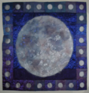
The central moon is layers of sheer fabrics, and the border elements are also layers of sheers - with holes cut out of the middle. How this technique developed is another story for another day; whether I want to use it again ... not sure ...
27 December 2010

Delights of the Rijksmuseum

While the hugeness of the main museum is being renovated, the Rijksmuseum in Amsterdam has an excellent display concentrating on the 17th century - the Dutch Golden Age.
Photography isn't allowed in the galleries, so out came the sketchbook, a much better way to "see" an exhibition than though the lens of a camera -
The model ship in the fist gallery was amazing - about 3 metres high, the size of a small sailboat! And the ink drawings on canvas of battle scenes were so very detailed - apparently the artist, William van de Velde, would be on board ship, sketching the battles as they happened
This image is of the Battle of Bergen (1665) -
Also recorded in my book are comments about the wall treatment in the galleries - what looks like flocked wallpaper seems to be huge stencils of fleur-de-lys patterns, done in matte paint over a shinier background colour (or vice versa) - looks great. You start noticing the walls after you pass through a dark corridor, painted dark brown with lots of names stencilled on the walls in lighter brown paint - hard to read entire names because of their length, not completely lit up by the spotlights along the wall.
Emerging from the corridor you see people sitting and smiling, looking at something intently - this turns out to be a clock, and what a clock - a new take on 'digital' by Maarten Baas -
see it in action here.

Also on my sketchbook page is my drawing of 11-year-old Harmen ter Borch's drawing of his 4-year-old brother Moses - drawing. Moses (1645-1667) was a very talented artist but died young, shortly after the battle of Chatham. His brother Gerard and sister Gesina did a memorial portrait of him. Not much is known of Harmen (1638-?1677), who gave up painting in 1661 - best known in the family is Gerard (1617-1681). All the children were first taught by their father Gerard (1583-1662).
Yes, The Night Watch was on display, as were other paintings by Rembrandt.
Another fascinating display in the museum are the two doll's houses; see the one shown in the postcard here -
The shop was full of tempting goodies - I do wish I'd bought this set of stamps, silhouettes from Averkamp's Winter Landscape -

Museum shop

Anne-Claire Petit has a range of crocheted goods made specially for the Rijksmuseum. The accompanying little booklet connects the buyer with a typical artisan: "This is Ti-Songli crocheting. Crochet is handiwork. It requires a great deal of experience and patience. Every item is made with care,and is therefore unique. There aren't any machines that can take over crochet work. Ti-Songli and her friends are skilled craftswomen. In China, where they live, they normally produce traditional hats and bags made from corn husk. From hundreds of expert hands, come the homemade products of anne-claire petit." The tulip music box was priced at 36 euros, the tulip keyring in the background at 10 euros.

Elsewhere, for 16 euros, these lovely teatowels - woven-in yellow jugs (referencing Vermeer), beige snowflakes, and brown feathers -
Travelling light, I didn't bring one home, and rather regret it now. A teatowel is one of those everyday objects that can be either an inconsidered rag or a small luxury. Years ago I splurged (£11 - then!) on a 4-colour-weave teatowel by Ekelund - it's still a daily treat to use it.

26 December 2010

Second life

This embroidery, on velvet, covered my filofax for several years. I was about to say goodbye to it and then decided to use it for my December journal quilt - the title will be "Byegones". I loved making it, and the time when it was made was a stepping-stone to many things - can't just throw it out!

25 December 2010

Kitchen action

Postprandial action after our Xmas Eve supper. The "new" kitchen is feeling more comfortable, now that the familiar shelves and plates and pictures are back in place.

24 December 2010

By train


Impromptu construction on the platform at Brussels -Antwerp (I think) - underground concrete caverns -
Rain on the windows; the next day it turned to snow and caused chaos. The announcement at Amsterdam station, which we listened to over several hours, was simply "The railway has a different schedule today. The weather conditions mean that some trains will be delayed and others will not run. We are supplying free coffee and tea at the Kiosk." Useful information -- and none of the wasted-breath pseudo-apology of "We apologise for any inconvenience this may cause" that you hear all the time in the UK, and that means absolutely nothing. When are they going to drop this silly little ritual?

It's beginning to look a lot like Christmas

The Vanillahoernchen are traditional in our house - shortbread with ground almonds, rolled in icing sugar once they're baked. The speculaas are my first attempt at using the mould I bought in Alsace in 1986 or so - they are very crispy but nicely spiced, and great dunked into coffee.

As for the Stollen - Thomas made a double recipe, knowing that we would quickly eat one of the loaves - delicious! We managed to get the rising time right, and the lemon glaze adds a little sharpness to the raisiny egginess of the dough.

With all this comes memories of my mother's annual christmas-cookie bakeathons, filling container after container - cookies baked at the start of December and eaten well into the new year. Cocos-makaronen, schwarz-weiss gebaeck, pfeffernusse, lebkuchen (ah the lebkuchen!), spritzgebaeck, anisplatzchen - and of course the ones made with cookie cutters and decorated with coloured glaze and sprinkles...
The star shapes and the hearts were the favourites.

23 December 2010

Map made of words

A linocut map of Paris by Mark Andrew Webber. It's the size of a room!

Typographic maps of various US cities are available here.

Building made of words

Haunted by memories of a manuscript on display in the (old) British Library, which was open to a page with Hebrew lettering making up pictures of fish and other objects, I've been looking for something similar on the internet. Haven't found it yet, but variations on the phrase "pictures made of words" are turning up some interesting images. This is the South Korea pavilion at the Shanghai expo; the letters making up the 25,000 panels are Han-geul (Hangul). More about the pavilion is here.

Missed seeing this

600 metres of picture framing, used to decorate a marble staircase at the V&A during London Design Week this year. Framing was supplied by John Jones, my local framer (and formerly art shop). Photo comes from this blog. A certain grandness and width seems essential for the idea to work - not one to try at home, then.

Amsterdam domestic

'Tis the season ...
This mural is near the Rijksmuseum -
Slightly tilty, but very charming -
Even more tilty - windows and doors have had to be carefully fitted -