You start with a good idea, and it's all very hopeful and you're enthusiastic -- and because you're in a hurry to make the idea into reality,
you don't pay enough attention or aren't critical about the decisions you're making.
And the result is a slight disappointment, or even completely wrong.
At last report I was about to cut the final two blocks, one to put a texture into the overly white area and the other to add sparkly specks of colour -
All done with the cutting -
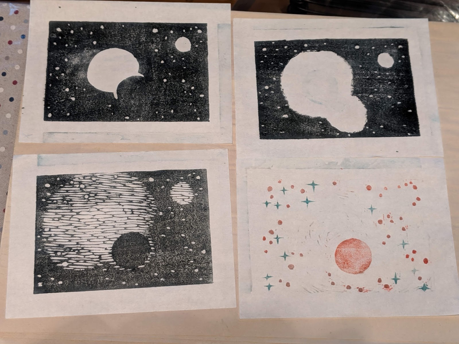
... and here are prints of each of the blocks. I was getting an uneasy feeling about it all (too dark? will it align or was I sloppy about cutting the registration marks? what did I think I was trying to do in the first place...)
In the combined print the texture was all wrong, there were areas that shouldn't have been cut away, and the colours weren't right -
Never mind, print some others and see what emerges ...
The table became a printing station for days on end, re-cutting, re-printing, etc -
Researching formats and textures -
 |
| by Biho Takahashi |
 |
| via @3ring234 |
 |
| via @andrewsmith6363 |
 |
| via @royalmuseumsgreenwich |
 |
| via @ikan8689 |
Serendipity sent this my way -
Perhaps mark-making in various media will lead to a suitable texture...? In any case, this research will be useful for other prints based on other ideas -
First, back to the current blocks - hastily printed after "a bit more carving" -
Considering the use of colour for the "stars" - will it even show up?
 |
| Aiming for red, not pink, dots |
 |
| With better registration, and using gouache, the colour might show up |
 |
| More textured, but just not right... a lighter grey for the first layer? |


No comments:
Post a Comment