Showing posts with label daily painting project. Show all posts

30 August 2014

Hiatus

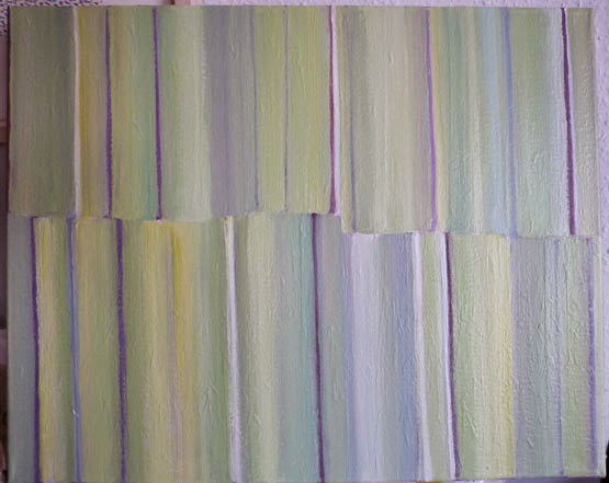
Following its recent daily changes, and a severe bout of sanding -
the stripey painting is going to have to languish for a while. A rest, a pause, a break. Hiatus.

I've started something new - same size - for which I had a definite starting point in mind ... but it's the first mark you make that determines the future history, isn't it. The first mark was a blog of copper paint
which needed thinning out and then became rather gestural, to be followed by more of the same, in different ways, for instance, blobs sprayed with water -
and then a brushload of really wet yellow paint drawn across the top and left to run down, with more swashbuckling with a small brush, lots of fun! This is how it stands at the moment -
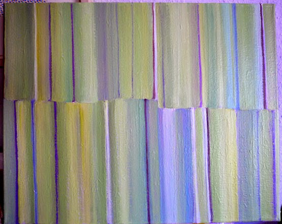
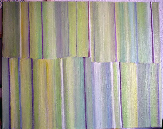
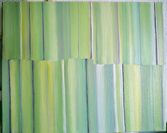
There is an element of stripeyness ... but the new painting seems to have a mind of its own, how good is that? The stripey one wasn't "talking to me" - I wasn't getting much input on what needed doing next. It was all becoming rather automatic.

At the moment the new one is saying "don't you dare go back to the original idea" - which was this -
Sonia Delaunay, 1928 (a dress fabric?) (via)

18 August 2014

Digital doings - getting the colour right

Getting the photos to look like the original painting isn't easy, and green seems to give the camera a lot of problems.
As it came out of the camera - cropped
After cropping, it needs adjusting it to fit into the rectangle (the keystrokes - on a PC, using Photoshop - are Ctl+A to Select All, then Ctl+T to transform, and holding down the Control key while dragging out the corners). Then the colour adjustment can start. Some people use Curves but I'm sticking with what I know, which is Levels (Ctl+L).

First, "tightening" by moving the little triangles to the point where the histogram starts -
Without "empty pixels"
To adjust for lighting conditions, hold down the Control and Alt keys and hit the B key -
Adjusted for lighting
Then I go back to Levels (Ctl+L) and choose individual colours, in this case Green, and move the sliders till the colours look like the painting, which is propped beside the computer.
Individual colours adjusted in Levels
On my screen at least ("your milage may vary") it pretty much matches the original ... and is certainly a far cry from what came out of the camera.

16 August 2014

Bring on the brights

The way the camera catches the colours isn't the way they actually are, and despite my attempts (using Levels) to correct this in Photoshop, it doesn't always work. For one thing, between taking photos of the painting at various stages, the light can change subtly, or even drastically. And the angle of the laptop screen might make a difference too. 

Can you see any difference between these? The previous stage was mainly blue(+white), with some thin stripes of cadmium red and payne's grey. 
with vermillion+white and magenta+white
now with neon pink
The neon pink was from a bin of "reduced for quick clearance" paints - £2.75 down to £1.75, how can you resist? For this sort of playing, and hopefully for monoprinting, they are just the thing, and I bought just about every jolly colour, including gold, silver, and bronze.

26 July 2014

Stripey painting - colour sources

Being away from home means the painting hasn't been "daily", but it continues. This week I found the "white bristle" brush in my hand, rather than the nylon bristles, and have been making both gradations of colour and very thin stripes -- both done very quickly, without agonising over decisions.
Before
Pink changes
Adding orange
More orange!
Colour still shows through the fresh layer of white
A magazine cut-out of  a Gillian Ayres print is still floating around near the tubes of paint, and when I get stuck for a colour to add next, I choose one from the print and see what happens. The latest addition was the white and the mid-blue; next, another layer of white perhaps?
"Tivoli" by Gillian Ayres (via)

More prints by Gillian Ayres
Another good colour source would be a painting by Ivon Hitchins - I love his colour combinations and especially the balance of colours in the compositions, whether vivid or sombre -

And then there are the flower paintings of Winifred Nicholson. "Honeysuckle and sweet pea" (via)  especially sings out to me ... the exuberance of the yellow, offset by the pale blue-green -
More of Winifred Nicholson's flower paintings 
Some of her work is on show at Dulwich Picture Gallery till 21 September, along with the work of her husband Ben and their friends Kit Wood, Alfred Wallis, and William Saite Murray; a review is here.

19 July 2014

Still stripey

(click to enlarge) 
Recently, more and more stripes have appeared on the daily painting. Every now and then I try to amalgamate some of them.

In today's version, some of the colours underneath still show a bit, and the dark stripes have been made into slivers -
This project has been going on for quite a while now, and I'm amazed at how much I look forward to getting into the studio and "doing something" to the canvas.

Now that I'm happier about using paint, it's all about the overpainting, about impermanence, about not needing to know what's going to happen next.

I'm not all that pleased with today's version ... it's rather reminiscent of a type of striped pyjamas I particularly dislike ... and despite a lot of repainting the balance needs further tweaking - but I did what I could with the three colours I squeezed out, and hey, it'll all be different tomorrow...

12 July 2014

Daily painting - speed v. indecision

One day the painting changed entirely - from brash to muted, from a try-out of all the transparent paints on hand, to using a few neutrals -
"Parchment" takes out some of the darker greens
Add in Payne's Grey and get rid of greens and blues
More greys, and the oranges are gone
Thin washes over the yellow
(Too thin.) A darker shade of pale was needed
That was done quickly, thanks to two tricks picked up recently. 1. Using the width of the brush, pushing it down firmly, to make the entire width at one go. This depends on having the right amount of paint on the brush before starting, which depends on the consistency of the paint and how much the brush holds, which influences how much pressure you put on the brush ... I'm still practising this ... 2. Using a folded wet cloth to swipe down the edge of the stripe to make it straight.

And I quite like the bit of variation in the stripes due to colour showing through, or paint mixing itself during the painting. More relaxed. Less maniacly controlled (and falling short of perfect). One thing leading to the next, no dithering.

Now the point of indecision is ... what colour next? There are still so many possibilities.
Possibilities for the next colour
(ochre fromIvon Hitchens? that red from John Craxton? green or brown from my JQ scraps?)
... or something gentle from the colour dictionary?
The camera made those grey stripes very blue, probably because of all the blue in Payne's Grey, which I'm using instead of black (I seem to have picked up some painters' prejudice against using black out of a tube.)

05 July 2014

Daily painting project - new this week

Last week I was lamenting not trying anything new. This week I had to remedy that ... and happened to notice the way the orange sang through from the back when the stripey painting had been sanded yet again -
Not sure if you can see it in this photo - maybe in the yellow, top left of centre, or in the blue, bottom extreme right?
Anyway, in conjunction with the results of colour application in the Structural Textiles course, it brought to mind a midnight sky with stars - with constellations - maps of constellations - and here are the first two attempts to put on paper what is in my mind .... the orange making a halo of the "stars" in the dark sky ...

Really tricky to photograph!! And ... how DO you paint stars?? What you can't see is the lines connecting the stars that make up the constellation, which I've scratched (embossed?) into the orange layer that went down first. (Those lines are important in showing the constellations.) The words are scratched through the blue-black paint mixture with the end of the paintbrush.

It's not quite "my vision" yet ... a little more work, some lateral thinking....

28 June 2014

Daily painting project continues

... with just the one painting at the moment - and that singularity is a good thing (for now). I'm still channelling Bridget Riley* ... and through the ever-changing juxtaposition of colours, information about interactions is trickling into my subconscious. 

The painting process with the ever-changing stripes is about making bad choices and then being courageous and being patient, and redeeming the picture through adding unexpected colours and carrying on with more till it looks better - and it's about repeating that circular process with the next bad choice ("fail again, fail better").
Using a picture of a print by Gillian Ayres as source for choosing colours
Using the "colour dictionary" as a source for choosing today's colour
"Joke blue" and "ledger magenta" have been added, as have some more narrow stripes
However this fascination means I'm not following one of my rules - to try different things. Here are some possibilities for different things to try -
Wild strokes and zingy colours - but where, how to start?
(By Jesse Willenbring, via)

Sparse shapes, clean edges, patterning; different formats
(Pink Plant With Shadow #1 by Jonas Wood, via)
Painterly marks and brushstrokes
(Artist and title not given; via)
Denser, varied patterning; contrast of shape; letting the background show through
(Veilles maisons sur le bassin de Honfleur by Raoul Dufy, 1906; via)
What's needed is another kind of subject matter for a new evolving painting ... or a theme for a series - this is meant to go on for a year, after all. 

My hurried attempt with unfurling peonies from a bouquet of buds fizzled out when I missed some of the stages of their unfolding -


but it got me looking at "pink" more carefully, and using brushes in different ways. 


*Bridget Riley has a show in London (till 25 July) - on three floors of a gracious old building, it includes some of her "working drawings" as well as large paintings spanning her career. 


Experiencing the large paintings face-to-face is very different from seeing them in books or on screen - at different distances, the colours have strange effects. All of which has been carefully worked out via the drawings, and then painted by studio assistants. 

In a 2009 essay on her work and process in "The Eye's Mind" she says: "Although careful never to presume 'to know' what the pictorial elements would do in a particular situation, I began to feel that experience was fuelling my enquiry and that, whether I felt prepared to make some advance - or not - I had no choice but to do so." and "You cannot deal with thought directly outside practice as a painter: 'doing' is essential in order to find out what form your thought takes."


Previous incarnations of the stripey painting were shown on 10 May,  31 May, and 21 June.

21 June 2014

Daily painting - stripey progression

The stripey canvas is now at a pink stage, and will get some bright green added next - one or other of these greens from the colour dictionary -
In the past few weeks, it's gone through quite a lot of colour changes, moving from "I like this" to "why did I put in that colour" to "absolutely horrible" to "it's starting to get better" to "I like this a lot and don't want to paint over it" to "oh no, shouldn't have done that..." and so on -


... and some that I don't have time to crop and straighten at the moment. (I don't have a particularly good photo setup for this.) And getting the colours exactly right in the photos is a lost cause!

Somewhere down the line I'll try to make an animation. New territory ... a challenge ...